Ideas / Client Stories / 8.19.2022

Designing the Scrim at the Jack C. Taylor Visitor Center

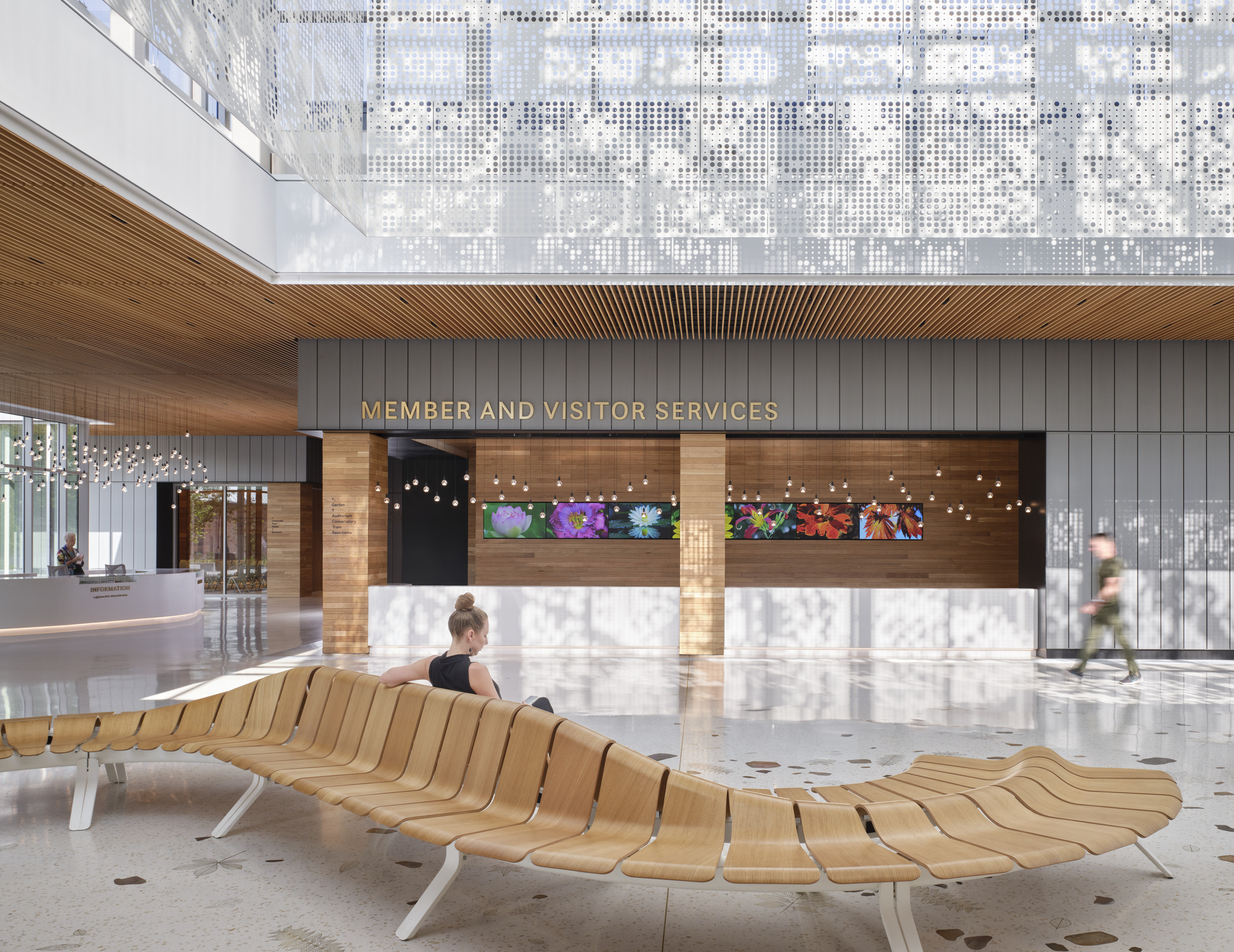
Dappled sunlight shines through the lobby lantern at the Jack C. Taylor Visitor Center

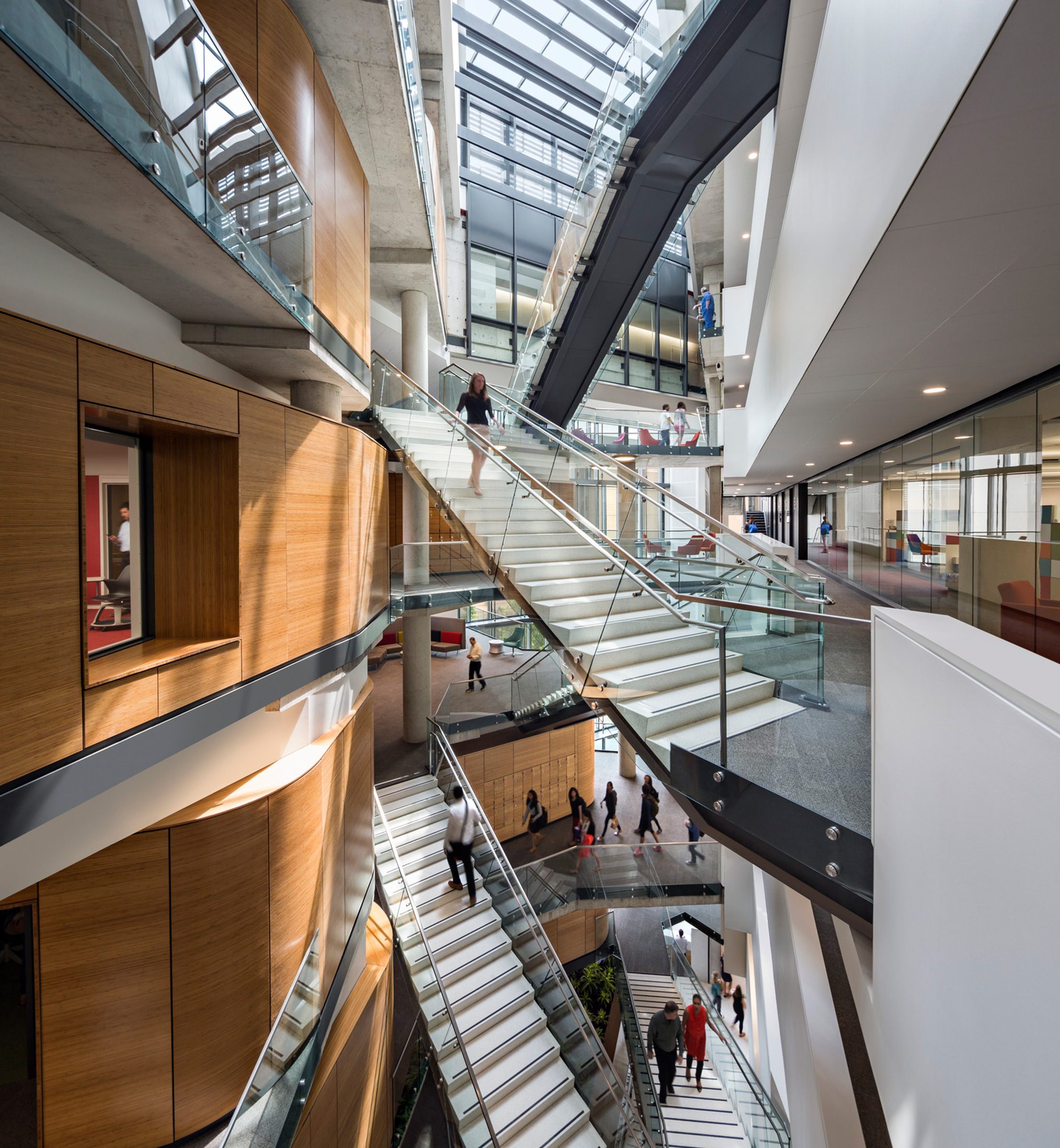
One of the core design principles of the Jack C. Taylor Visitor Center at the Missouri Botanical Garden in St. Louis is the idea of continuity – bringing the Garden to the visitor and dissolving the line between interior and exterior. Simply put, we wanted visitors to have an immersive experience of nature that wasn’t broken by the building itself.

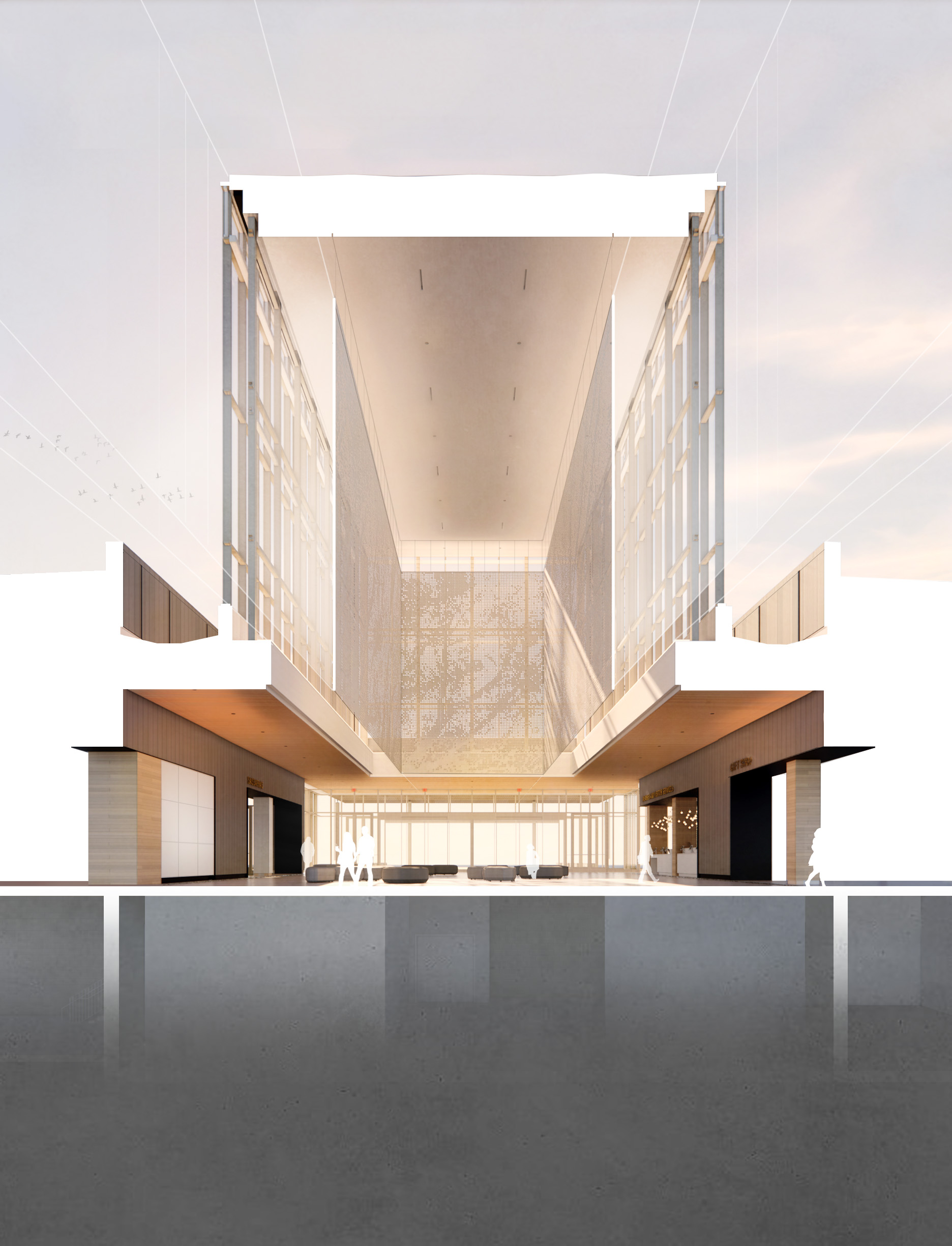
This vision is brought to life through the installation of the main lobby feature referred to as “the scrim.” Suspended from above the ceiling, the scrim is designed to filter light in a way that replicates the experience of walking beneath a canopy of trees.

The design was inspired by an existing allée of mature trees lining the Garden’s north entry drive. Visitors can experience the lobby as a “clearing in the woods” – a space that inspires a moment of pause, reflection, and discovery. Expansive low glass at both ends of the lobby provides visual and physical continuity of the Garden’s main axis. To the south of the lobby, a series of new trees will continue the rhythm of the north allée, terminating at a prominent gingko tree.

One challenge our team faced was determining how to detail the scrim in a simple way to emphasize the quality of light and minimize the importance of the form itself.
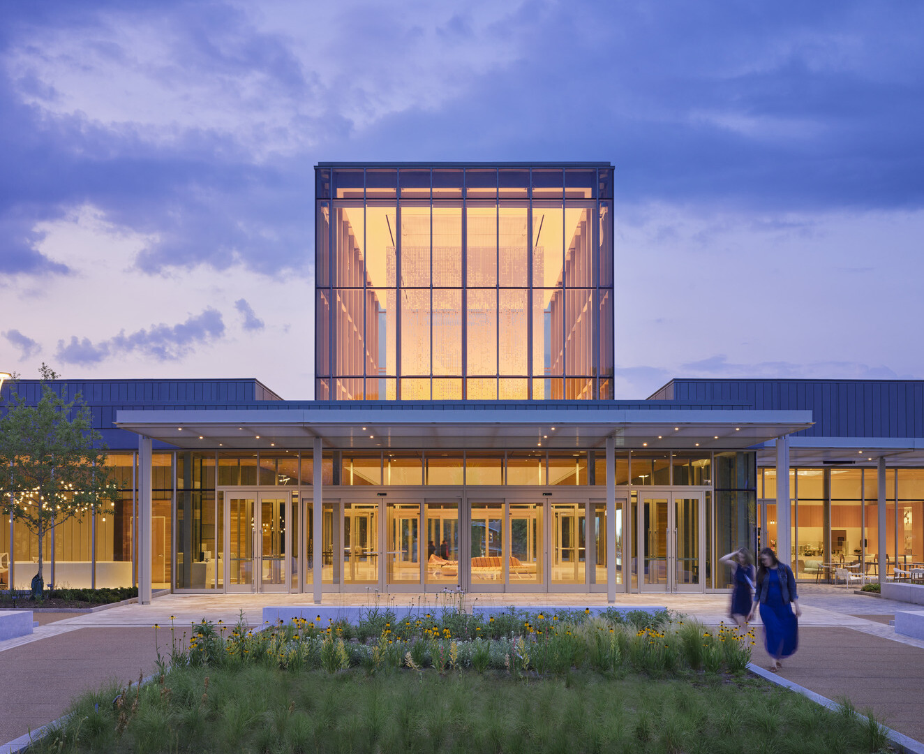
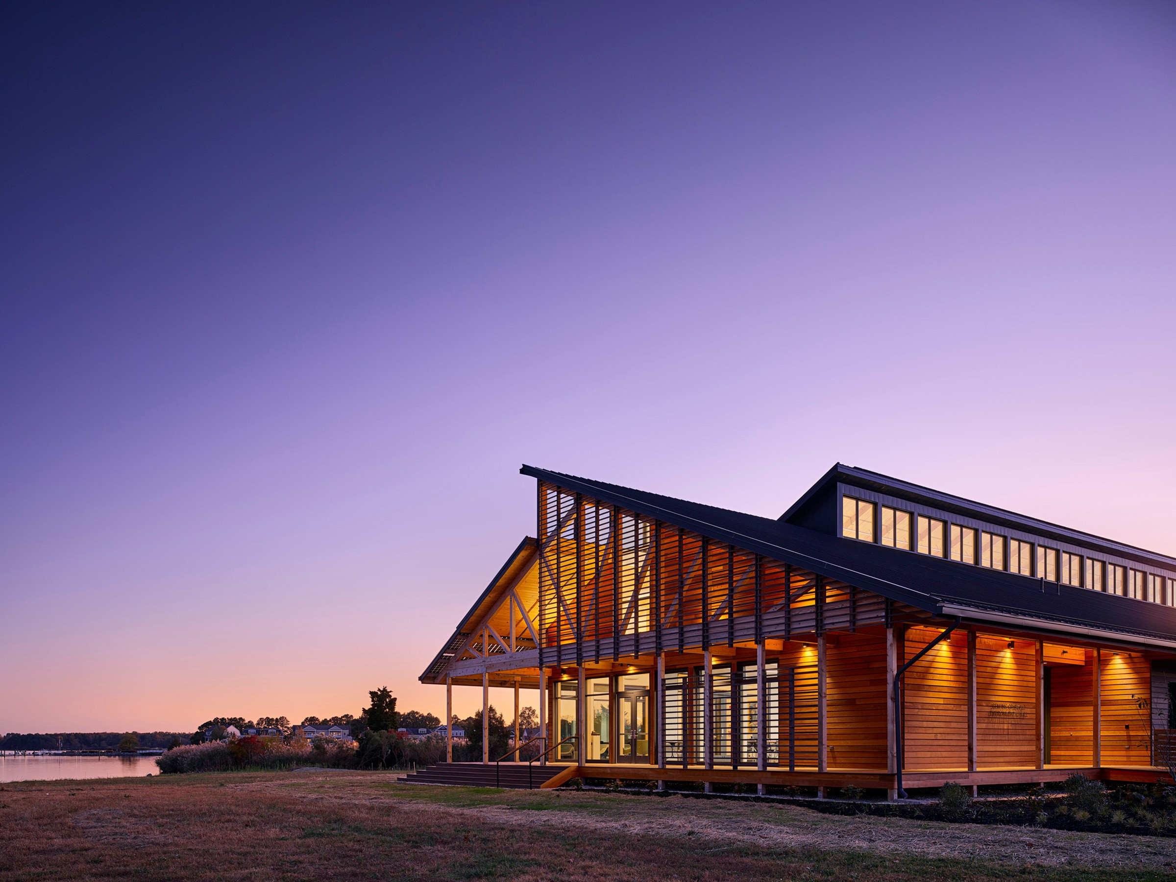
The lantern glows at the Missouri Botanical Garden at night.
View of lantern from south garden.
Section perspective through the lobby, showing the scrim in context
Section perspective through the lobby, showing the scrim in context.
The Design Process

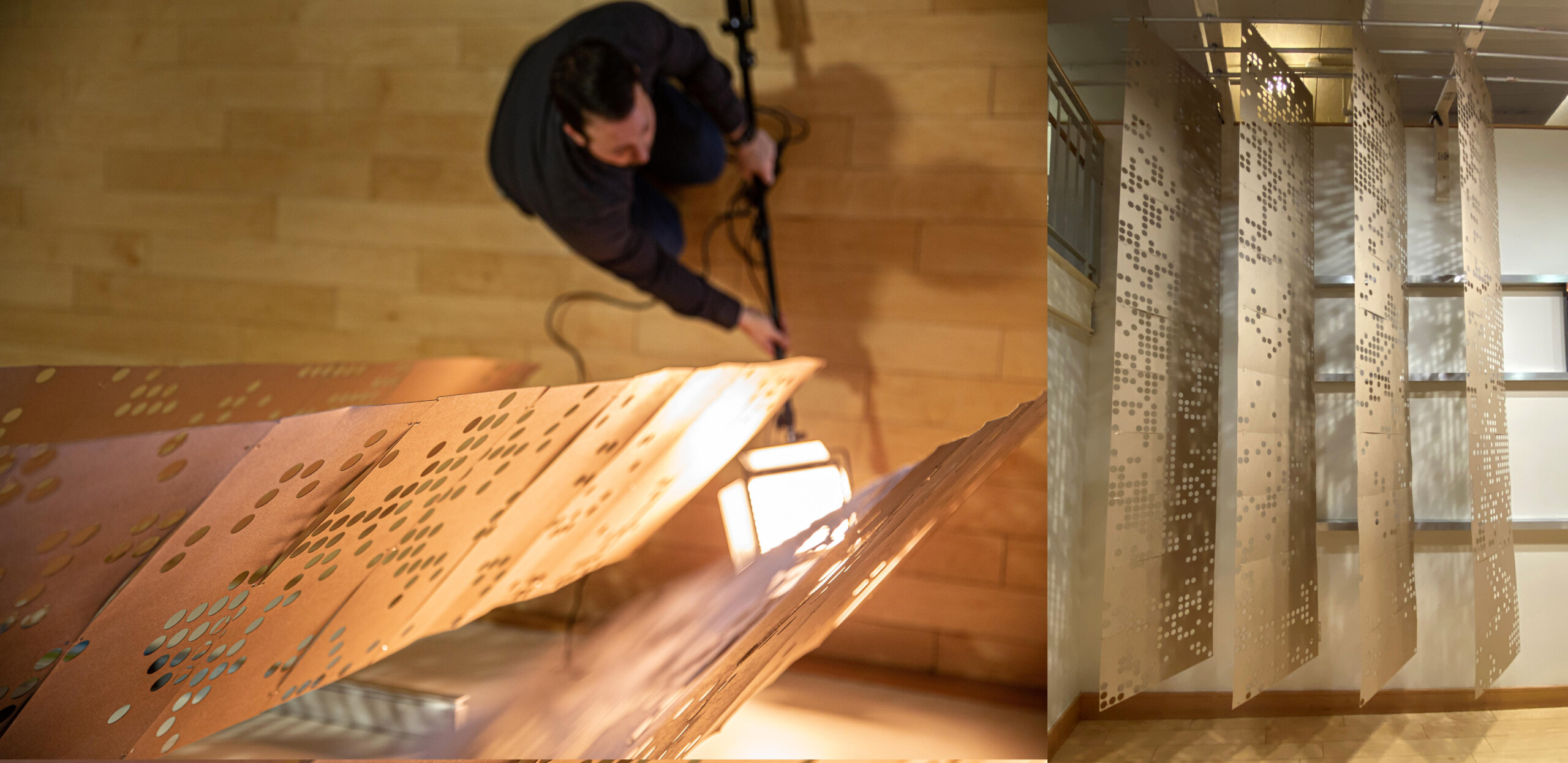
The design of the scrim progressed through numerous iterations ranging from fins to sliding panels to a heavier framed structure. A series of full-scale mockups created in the Ayers Saint Gross Baltimore model shop helped the team to visualize the scale and shading effects of the installation. Anyone who worked at or visited the Baltimore office in late 2019 probably remembers seeing the mockups lining the main entry of the office.

Fin mockups hang in the Baltimore office, allowing the team to determine how they filter light.
Scrim mockups in Baltimore
Fin mockups in the Baltimore office allowed employees to test how the scrim could filter light.

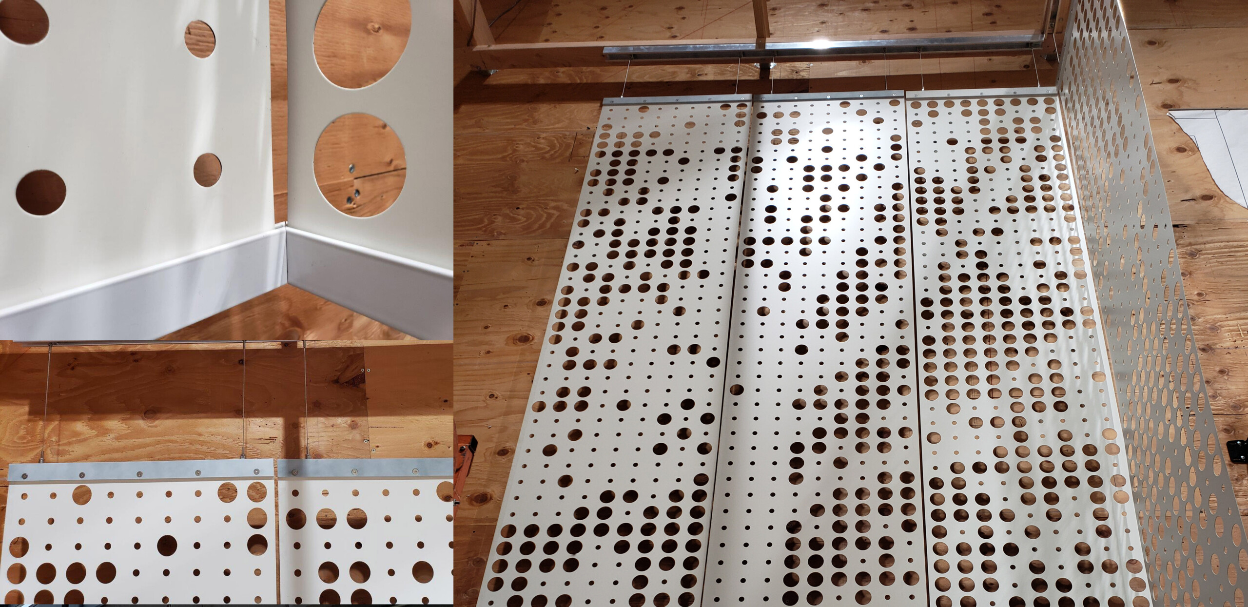
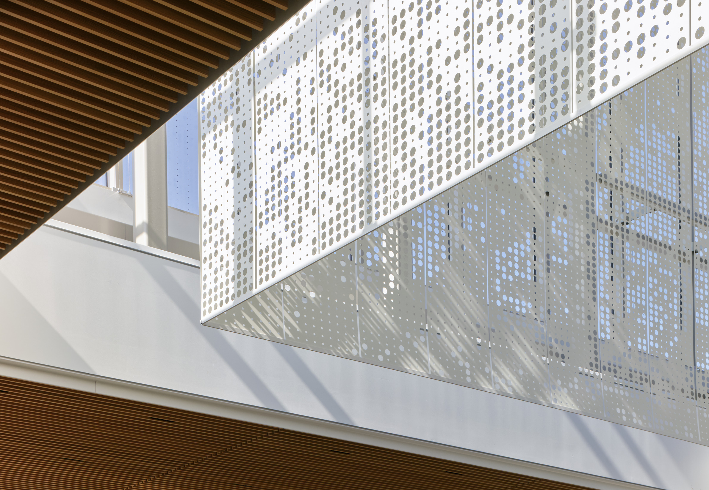
The final installation is made of 1mm perforated coil aluminum, and has a thin, veil-like quality that is almost more delicate in its final installation than in renderings. We worked with Hunter Douglas South America (Santiago, Chile) to create a custom suspension design that utilized their Stripscreen product, which is typically tensioned between springs for use in exterior retrofits.

Measuring 60 feet by 20 feet in plan, the scrim is comprised of 80 panels, each 2 feet wide by 28 feet high, weighing in at 3,500 pounds in total. The top of each panel is individually suspended from the structure above by two aircraft cables with built-in adjustability to achieve alignment between panels in the field. A thin bar (spliced together in 10 feet segments) holds the bottom edges of the panels in alignment while allowing for lateral movement. Several full-scale mockups in Chile and St. Louis allowed the design team to fine-tune the details and understand the challenges that would be met in fabrication, packaging, shipping, and installation.

Full scale mockups in Chile including bottom bar corner detail, panel top detail, and full corner...
Full scale mockups in Chile including bottom bar corner detail, panel top detail, and full corner mockup.
Pattern Generation

The perforation pattern was one of the most important and studied elements of the scrim design. It was our goal to balance beauty and functionality — transforming the quality of light while also shading key areas such as the ticketing desk. Solar studies helped to determine specific areas of the scrim perforation pattern that needed to be densified to reduce direct sunlight and glare to critical areas of the lobby.

Solar studies helped to determine specific areas of scrim perforation pattern that needed to be...
Solar studies helped to determine specific areas of the scrim perforation pattern that needed to be densified to reduce direct sunlight and glare.

The pattern for the scrim was generated using the Rhino 3D computer graphics software and based off a collage of photos of gingko trees throughout the Garden. Although the images are abstracted, you can imagine that walking through the dappled shade of the lobby might be a similar experience to walking beneath one of the garden’s gingko trees.

A collage of gingko leaves served as the base model inspiration for the scrim's pattern
Final Thoughts

The scrim is a prominent feature of the visitor center, but it’s only one piece of the story being told about the Garden and its research. The design of the space relies on varying levels of abstraction and biophilic design to create an experience that can be as simple or as rich as each visitor makes it.

Pressed botanicals and a massive log bench in the café allow visitors to relate directly to physical specimens, while delicate bronze leaves set into the terrazzo flooring are simple 1:1 scale abstractions that educate about native tree species. The scrim encourages visitors to pause and reflect on the scale and importance of the work being done at the Garden — the thousands of species housed, discovered, and named there — and the impact the institution has in the community and globally.


Indoor view of the lobby lantern at the Jack C. Taylor Visitor Center
The Gingko-inspired scrim at the Missouri Botanical Garden
The furniture at the Missouri Botanical Garden draws inspiration from natural forms.
Your browser is out-of-date!

Update your browser to view this website correctly. Update my browser now

×