This site uses cookies – More Information.
Signage and Wayfinding Master Plan and Implementation

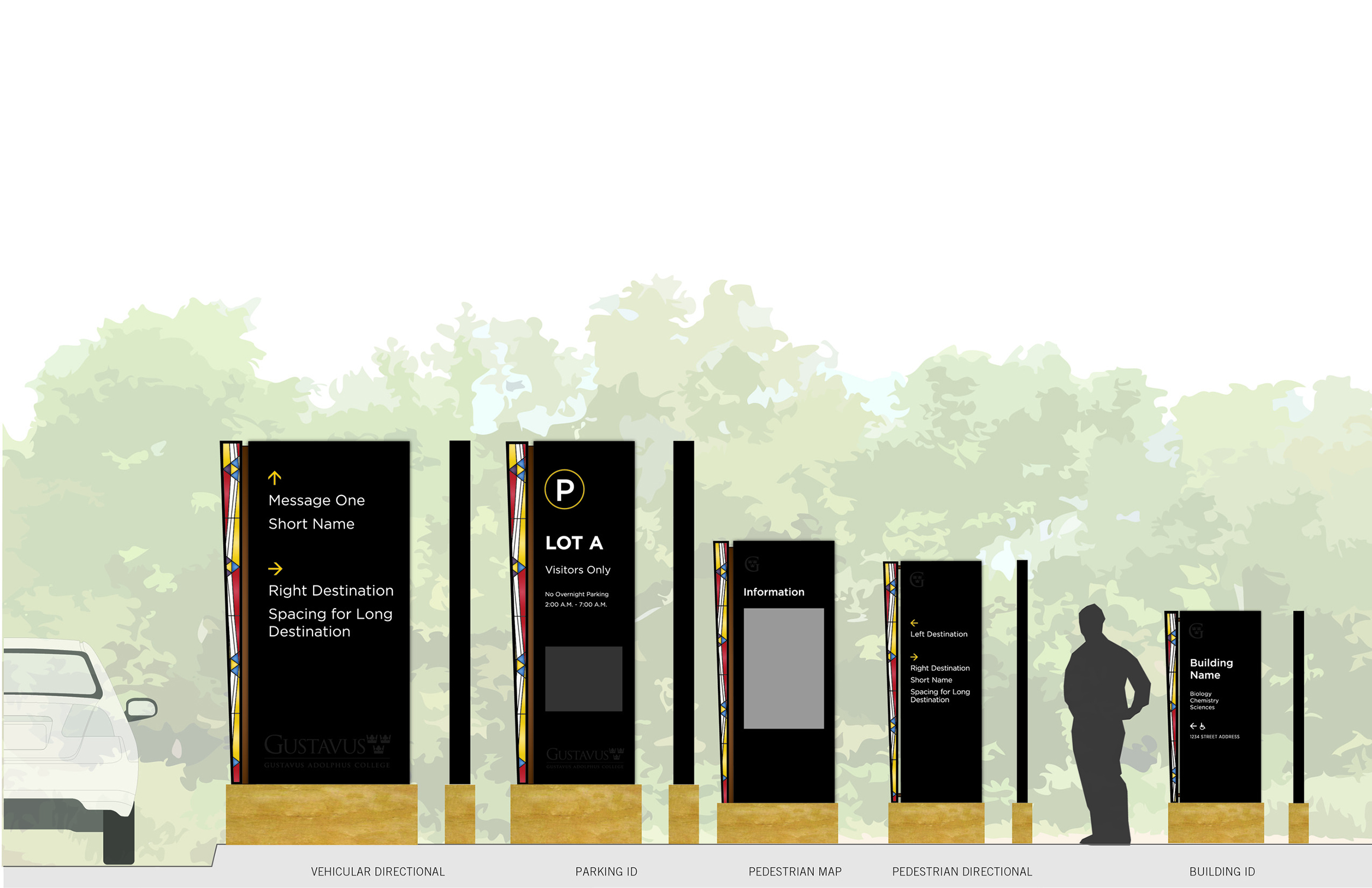
Gustavus Adolphus College is a private, residential liberal arts college in St. Peter, Minnesota. Founded in 1862, this 340-acre, four-year institution prides itself on warm and welcoming human interactions guided by five core values: excellence, community, justice, service, and faith. The Signage & Wayfinding Master Plan includes general recommendations for an integrated system approach to vehicular and pedestrian directional signage, parking identification signage, maps and architectural lettering, as well as interior building signage. After producing the plan report, Ayers Saint Gross continued the project through implementation.
Signage and Wayfinding Master Plan
The signage and wayfinding planning process for Gustavus Adolphus College engaged a wide range of participants from the campus community. Beginning in the winter of 2018, the design team met with the college to gather information in an engaging vision session, to share and refine designs, and to gain design approvals from the Wayfinding Committee.
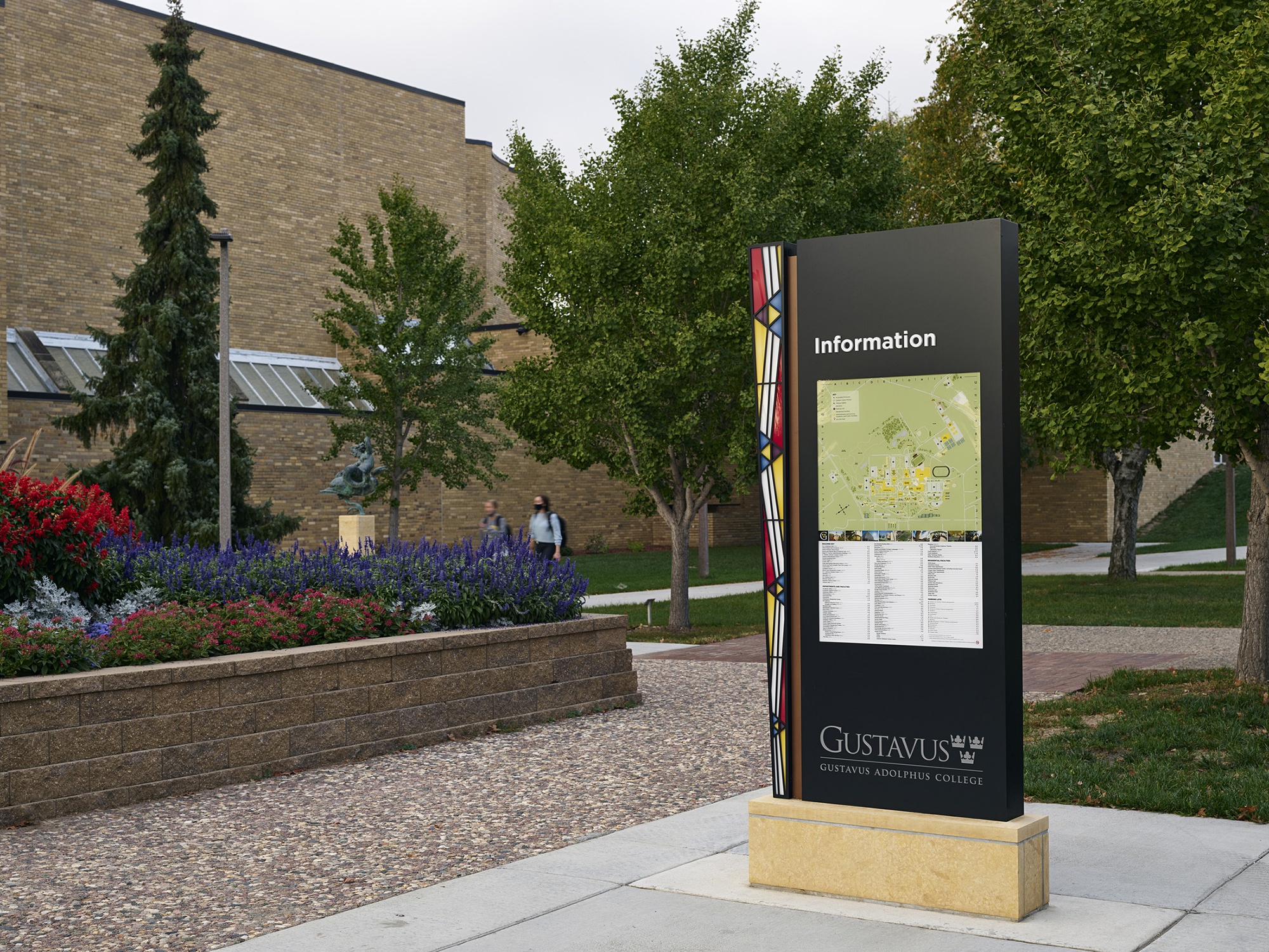
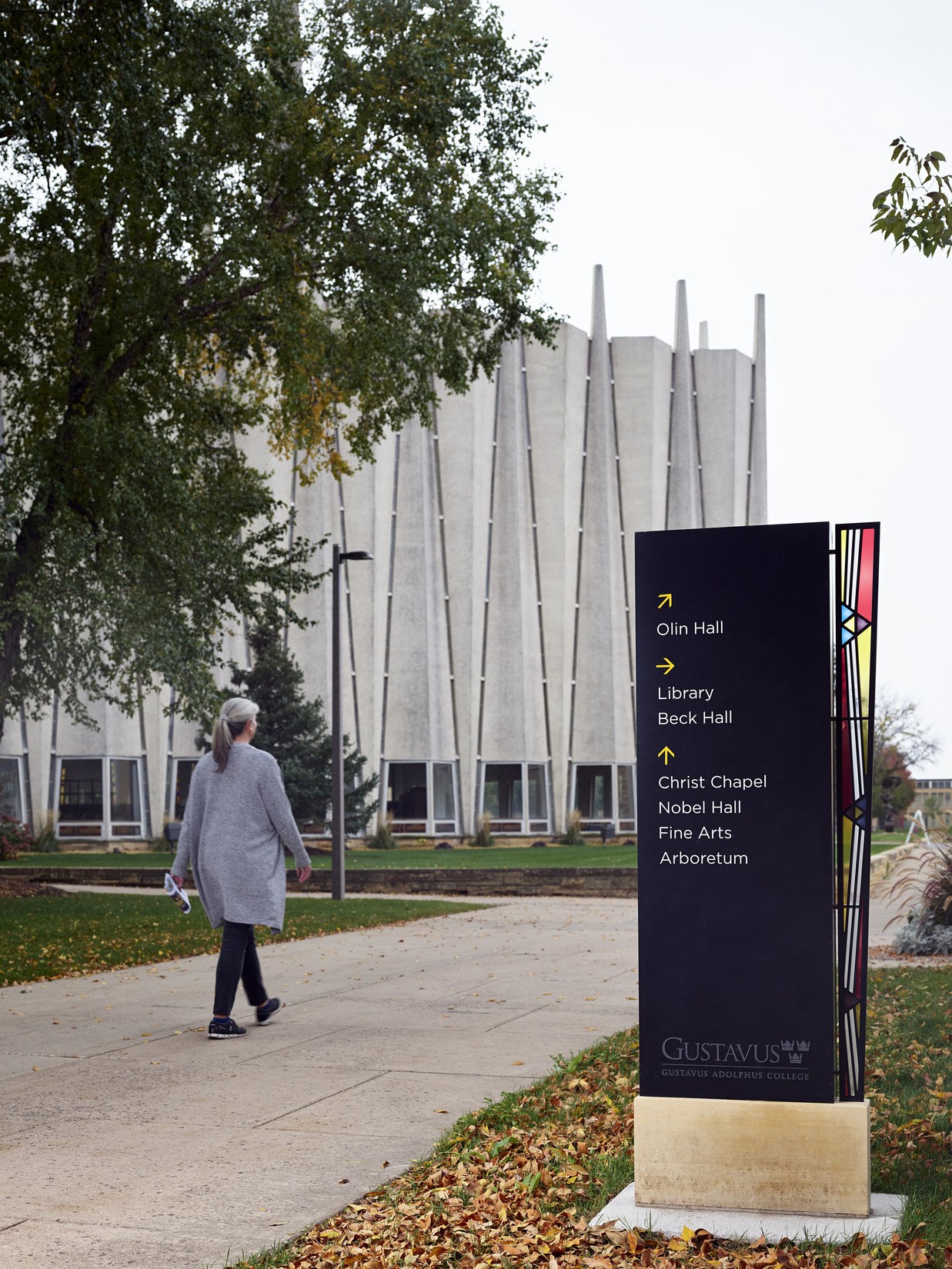
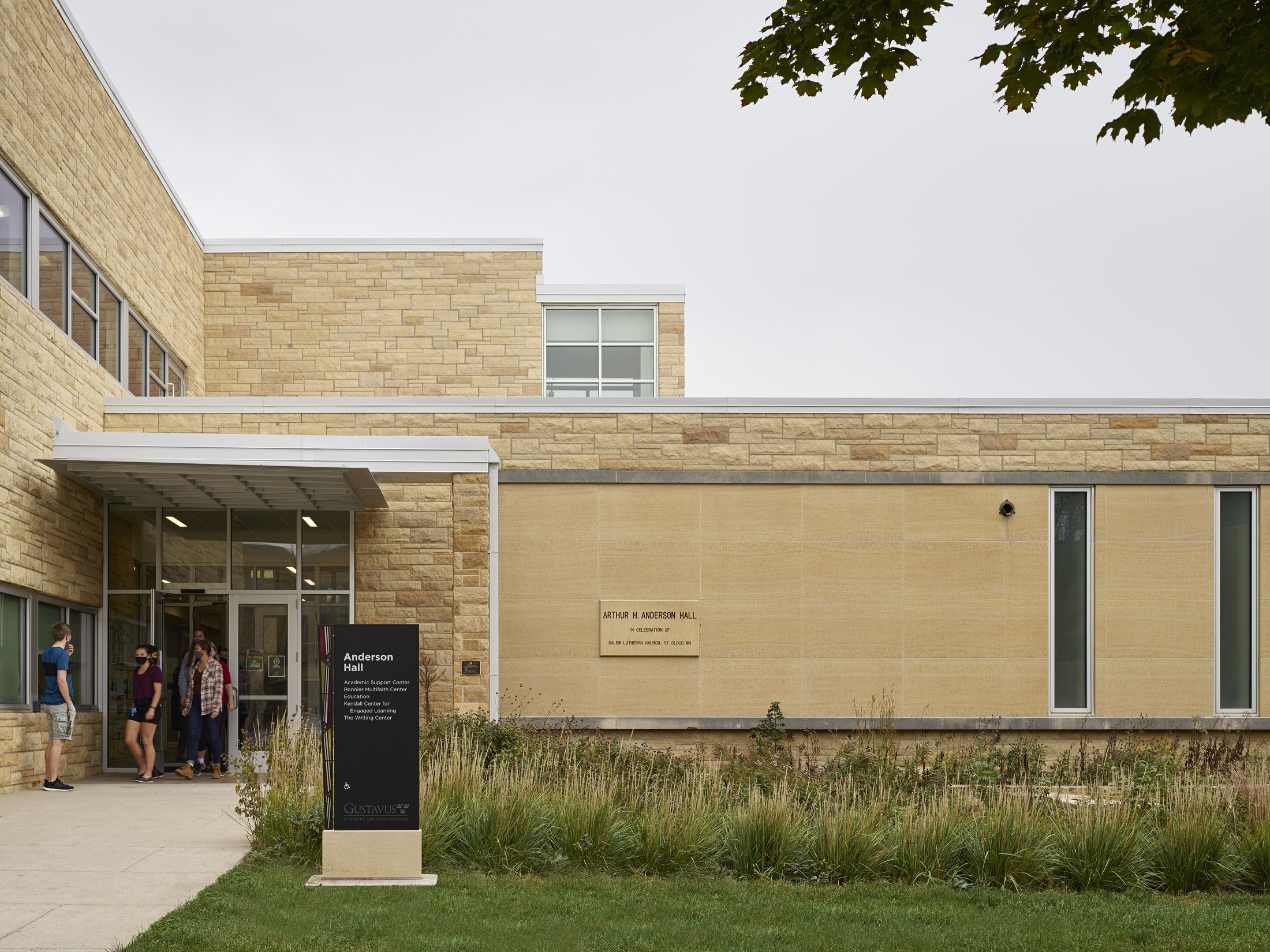
Exterior Pedestrian, Vehicular, Directional, and Building Signage
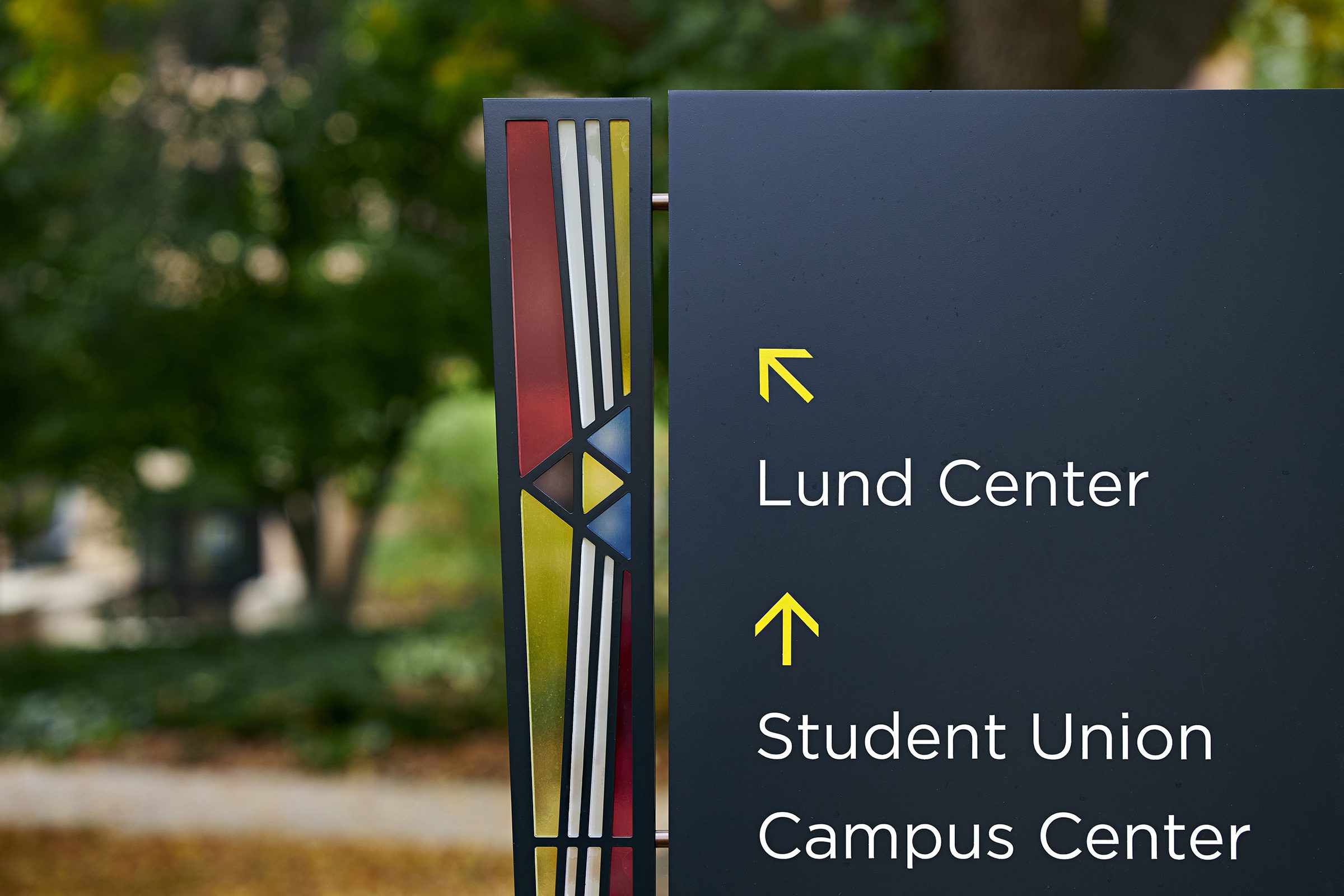
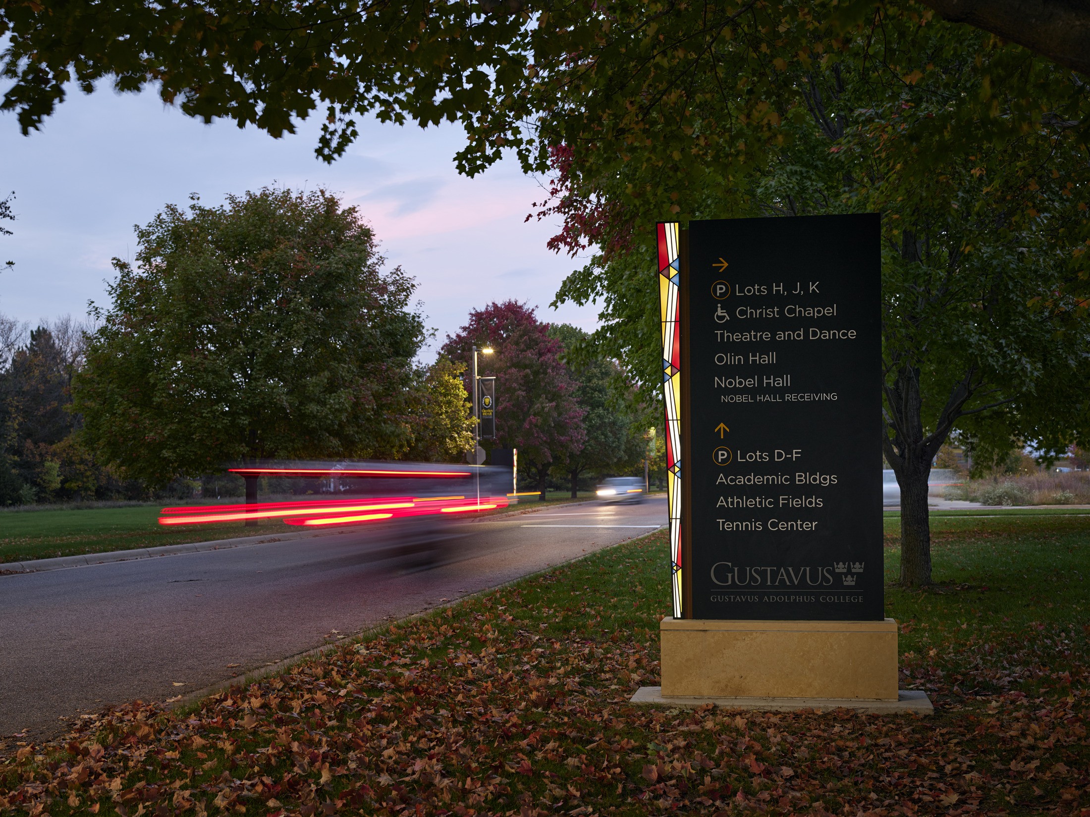
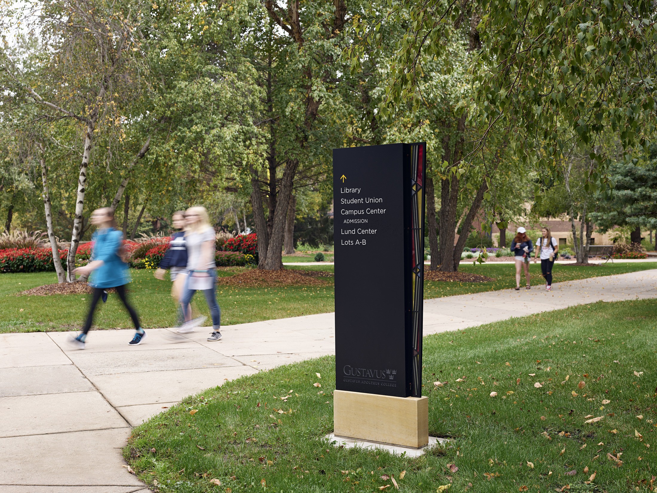
For all exterior signage, the full Gustavus Adolphus College logo appears in the Gotham font. This sans-serif typeface has humanist attributes and open counters optimized for legibility. Sign colors and finishes are contemporary with a charcoal color that is bold enough to notice, but not too bold to distract from the environment. The sign family’s custom stained-glass pattern pulls inspiration from the college’s iconic Christ Chapel, located at the heart of campus. The black pylons set on a base of native Kasota stone establish a bold, yet simple, pattern of wayfinding across the campus.
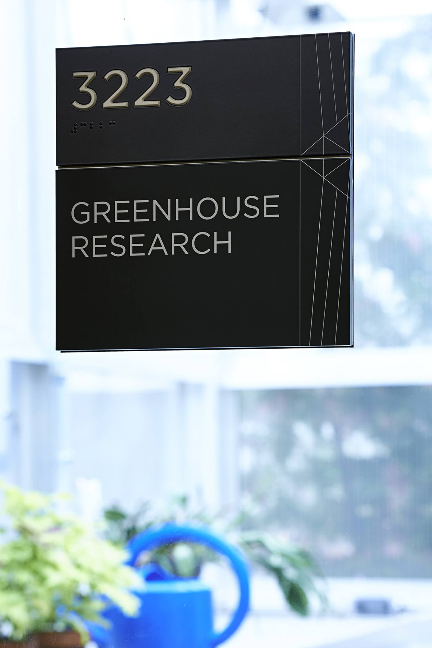
Interior Signage and Wayfinding
The Gotham font and dark finish continue to be used for the interior signage, which is consistent with the college’s print brand standards. This allows signs to be easily recognizable and coordinate with most typical interior surfaces and finishes across campus. Ivory lettering provides a sharp contrast for legibility. The simple linework pattern etched into the acrylic links the interior signs to the exterior signs.
Gateway Signage
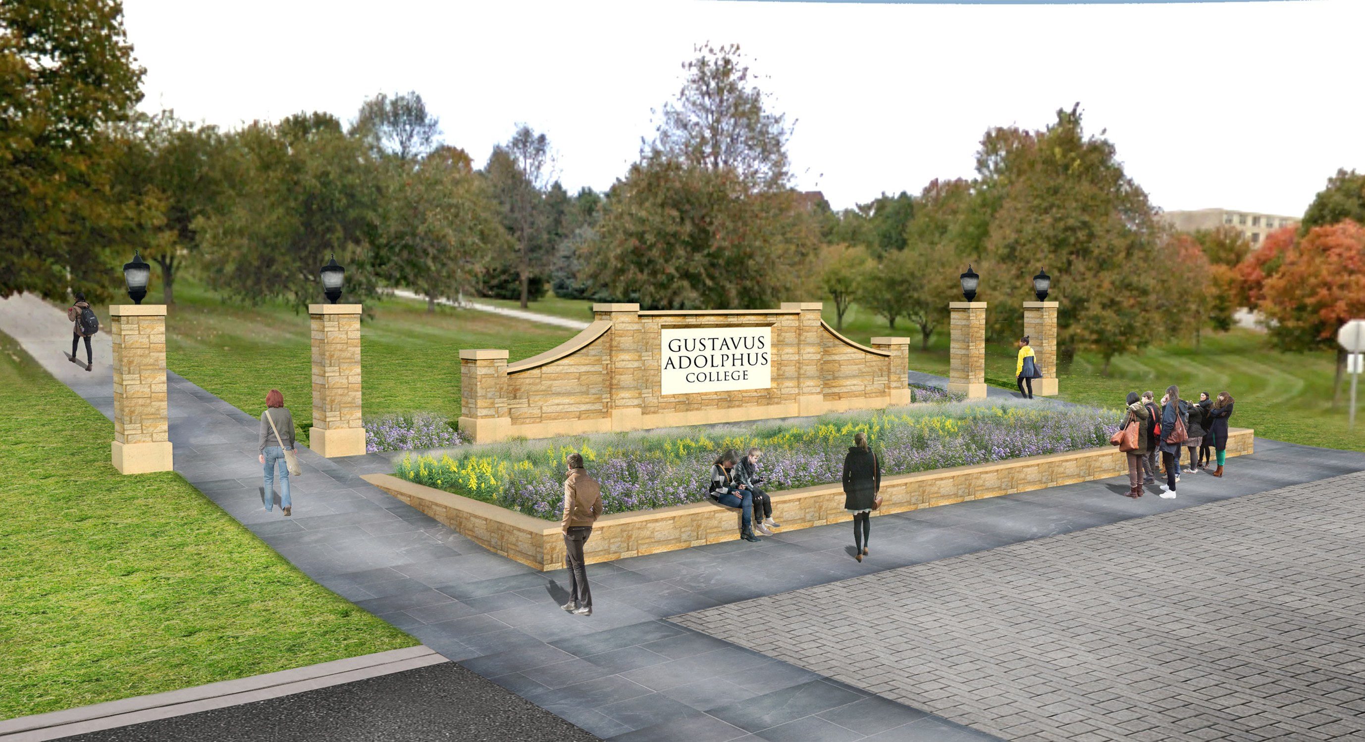
The design team also designed a new gateway sign, which will improve a visitor’s first impression upon arrival once they are implemented in the next phase. The goal of the new gateway signage is to elevate the presence of the Gustavus Adolphus sign with something grander, while maintaining its sentimentality. To elevate the arrival experience, the signage is extended to the medians, prior to the initial turn onto campus. There are two existing piers in the medians; one on either side of the entrance drive. The proposed design retains these existing piers and extends a low cured wall of native Kasota stone outward from each. The final design also incorporates steps behind the sign for groups to gather for pictures.
