Ideas / Research & Design / 10.11.2018

Renewal of Mid-Century Campus Legacies

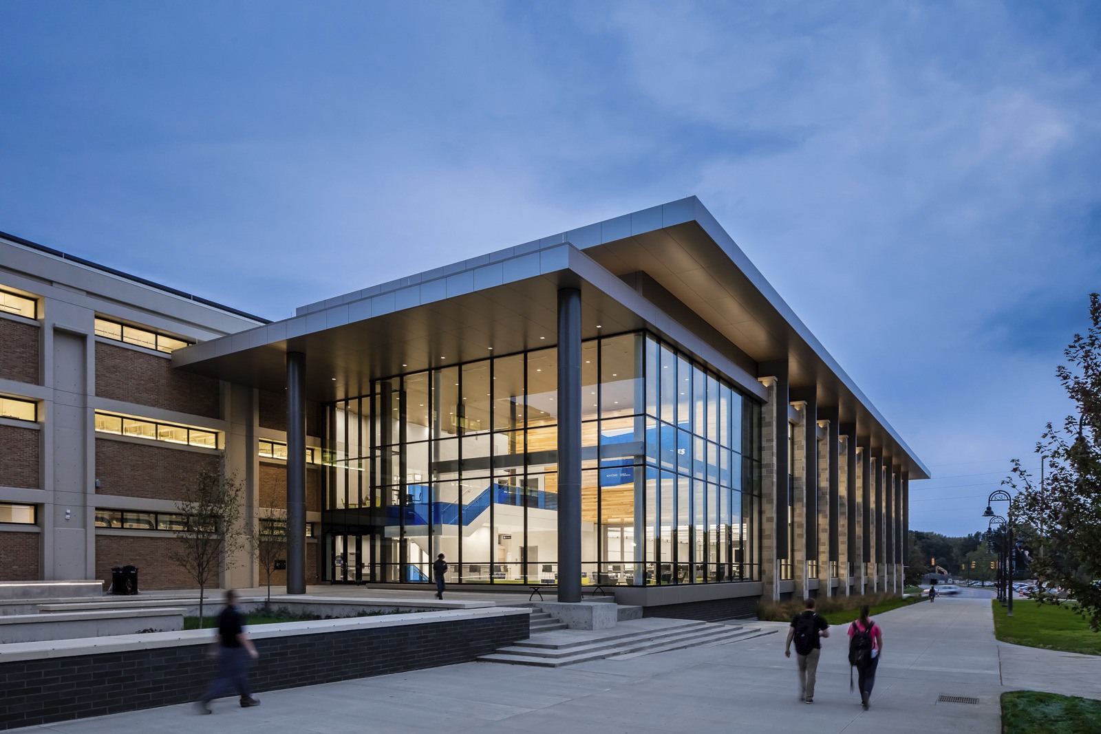
The new Integrated Sciences Building adjacent to Williams Hall at Kent State University

The post-WWII era brought a surge of construction to college campuses, fueled by the GI Bill, the Space Race, increased science research funding, and the demographic tsunami of the Baby Boomers. The building designs from that era demonstrate a range of characteristics: the textured surfaces of mid-century modern, the simplified structure of minimalism, or the stronger, more formalist voice of Brutalism. Often characterized by raw concrete construction of simple blockish forms, the buildings allowed institutions to project a forward-thinking sensibility and build significant structures economically.

The result was a sizeable and often challenging generation of campus development. Some buildings and landscapes from this era have stood the test of time in both beauty and functionality, but many have not.

Additionally, buildings and their infrastructure systems have a cycle of obsolescence, no matter the era of initial construction. They wear out over time, usually requiring reinvestment after about 30 years and certainly around 50. Even when the physical structure is sound, the activities that a building supports will change, as do safety regulations, programmatic best practices, and technological and design innovations.

Today, many universities are at a crossroads regarding what to do with these buildings. Is the wisest choice to reinvest in existing buildings and their infrastructure systems? Are there effective ways to renew or repurpose these structures? Or is the best choice to rebuild?

The first step in answering these questions is to start with an objective assessment of the building: architecture, engineering, cost, land value, campus planning, strategic initiatives, and historic preservation. Information about the building’s existing conditions can be developed in layers, increasing in detail as likely scenarios come into focus. Some key factors to consider are the integrity of the facility’s structural systems, and if its floor-to-floor heights allow for modern mechanical and electric infrastructure. (For a deeper dive on this part of the process, I recommend this recent article from The Chronicle of Higher Education, “How to Make Old Campus Spaces Feel New Again.”)

Once the assessment is complete, options develop: what is possible, what will result in a great building, what implementation strategy works, and how it will be financed.

While no two situations are alike, we do see consistent themes (and solutions) on how to approach challenging decisions about the use of these existing buildings in our practice. As more institutions face decisions about how to handle mid-century buildings, the following case studies provide progressive and forward-leaning strategies that make investments in current students and in future generations.

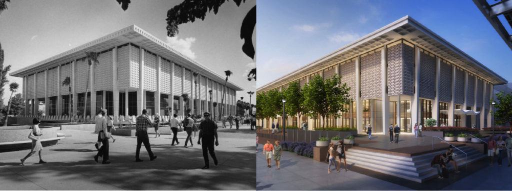
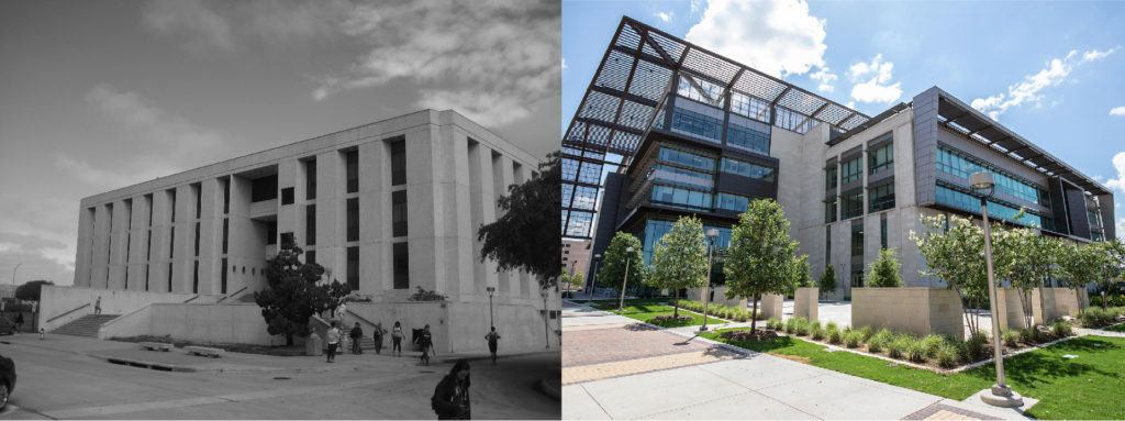
A before and after image of the Hayden Library reinvention.
1. Reinventing an icon.

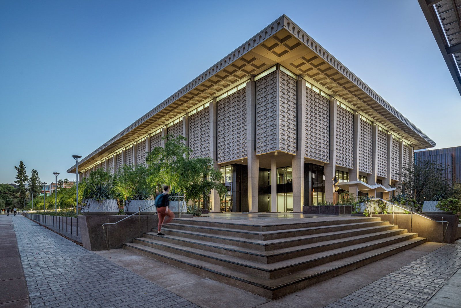
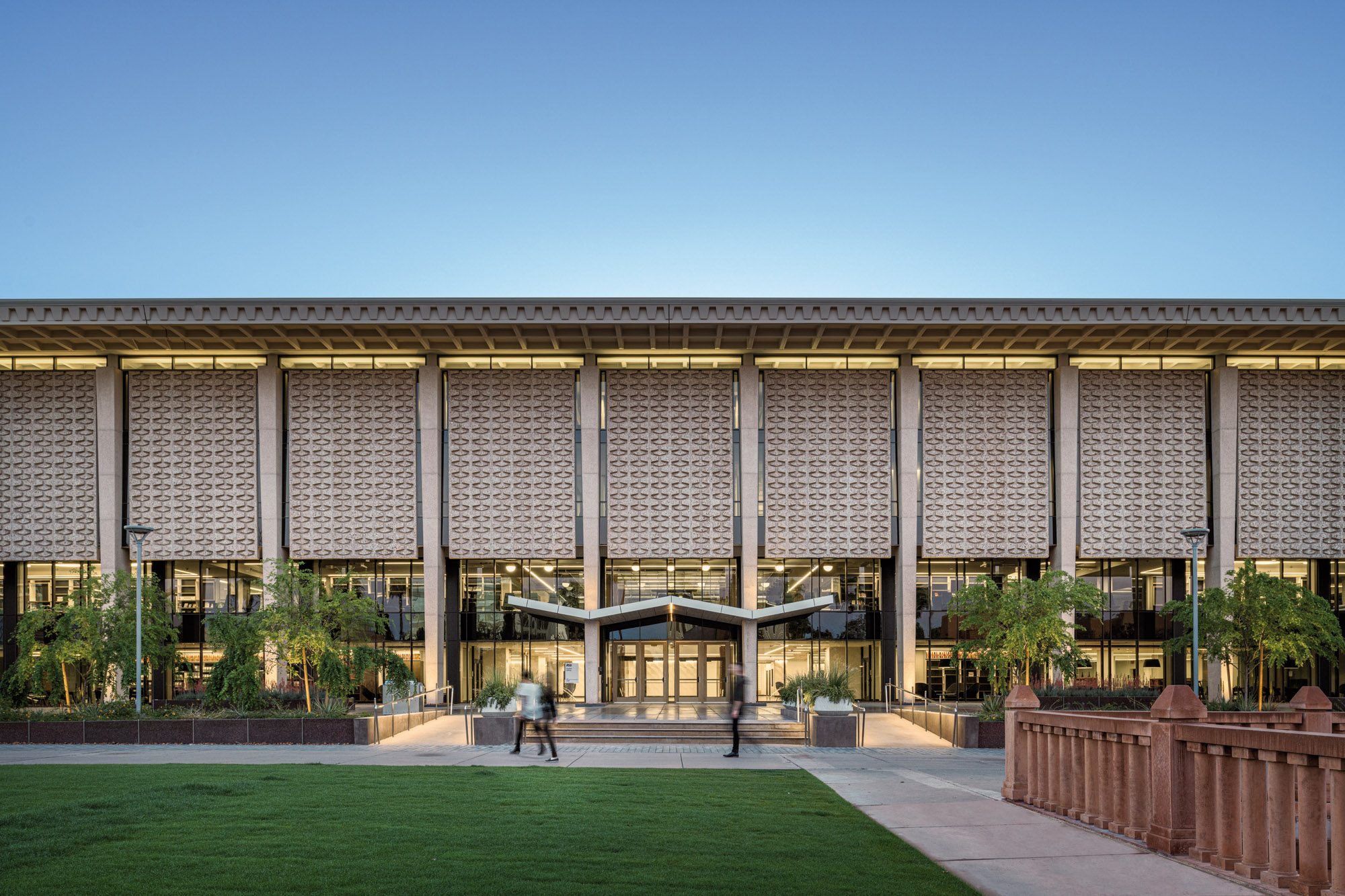
The Hayden Library at Arizona State University was built in 1966. While the geometric lines of its façade give the exterior an enduring aesthetic appeal, its interiors no longer support the needs of a modern library. To transform it from a place primarily for books into a place for people, the interiors needed rethinking and the way the building met the ground externally needed to change.

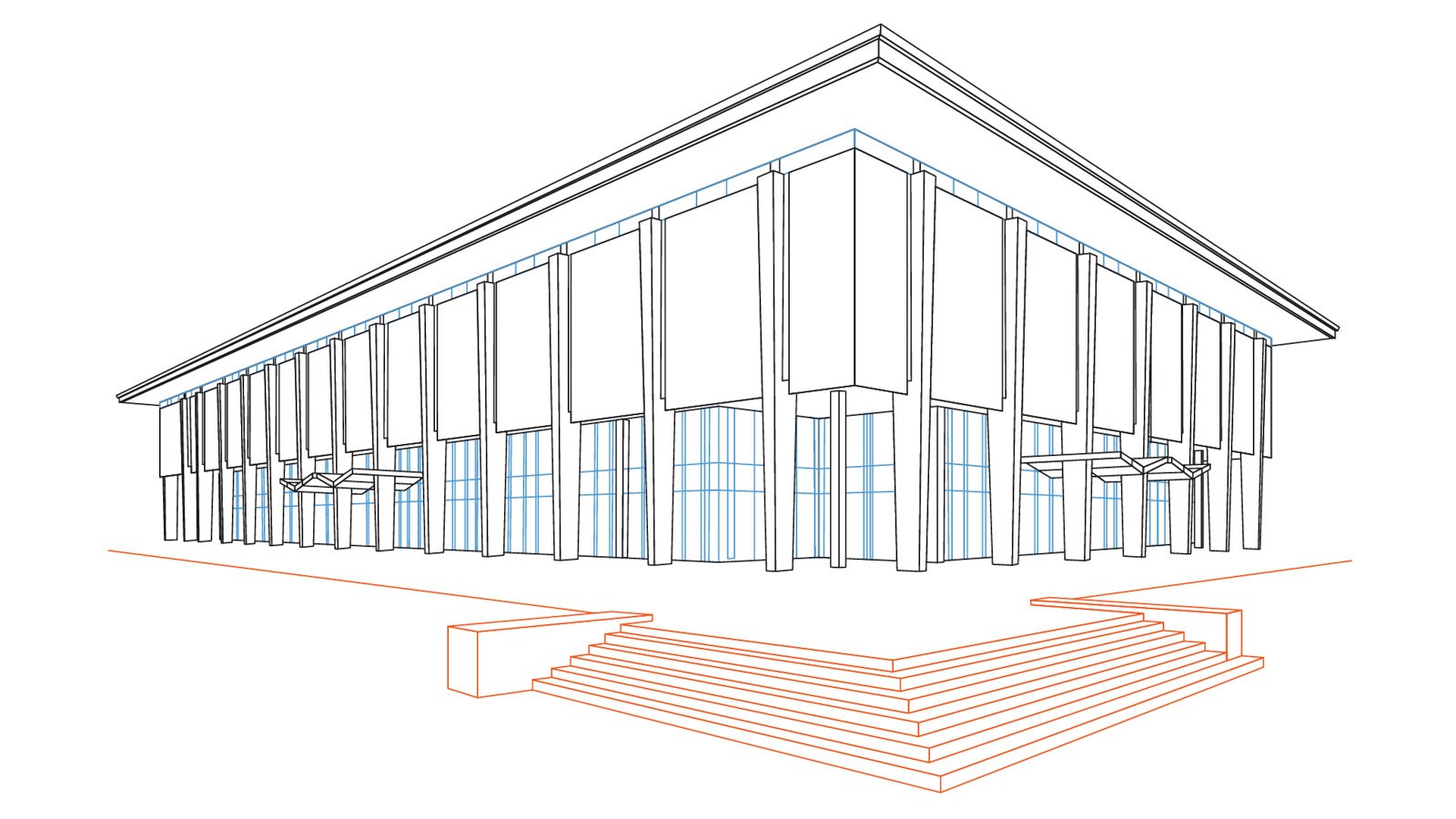
Previously, a depressed concrete moat surrounded the building tower, separating it from campus and putting a key entrance below grade. Partially filling the moat makes the library more accessible to pedestrians and more connected to its surroundings via a cohesive plaza and accessible entries. The substitution of glazing for granite paneling at grade creates transparency, adding daylight and visibility.

To support a modern, student-focused interior environment, 75% of the books were relocated to other Arizona State facilities. (They are still available to users via special order.) In addition to the reduced number of volumes, the relocation of mechanical systems from inside the library itself to a new annex freed up nearly 6,000 net square feet of space for new programming.

A sketch of the Hayden Library Reinvention

When the renovations are complete in 2020, the library will house a business incubator space, a green-screen studio, innovation labs, and large and small study spaces. The library will be an inclusive interactive hub where people from different disciplines can come together for team-based learning and innovation. From a distance, the changes at Hayden may be less apparent than some other renovations, but the building has been reinvented in a way that better serves the campus.

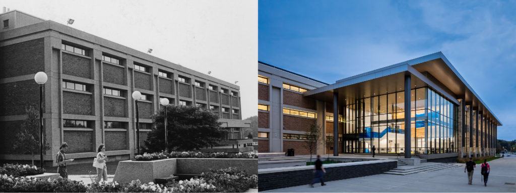
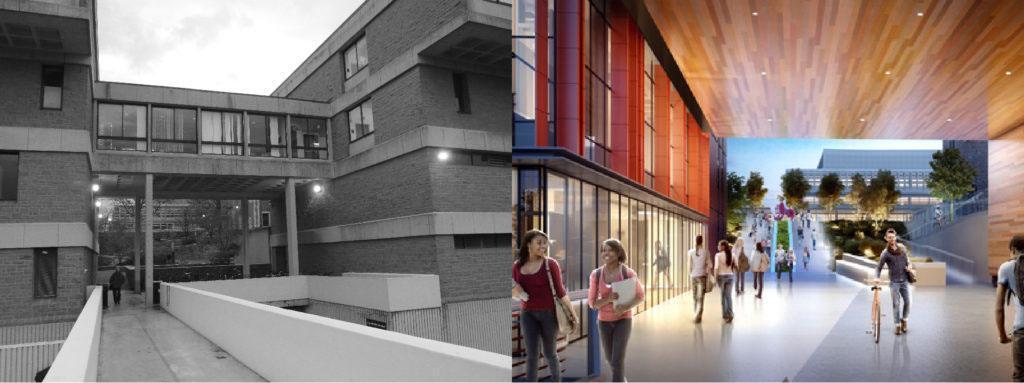
A before and after shot of the Sciences building at Kent State University
2. Incremental steps in pursuit of a bold vision.

Kent State University has a trio of 1960s Brutalist buildings – Cunningham Hall, Smith Hall, and Williams Hall – on its Science Mall which respectively housed the Biology, Physics, and Chemistry departments. All three structures underwent interventions of varying degrees to address deferred maintenance, improve accessibility, and reflect the school’s commitment to supporting new pedagogies and curricula.

Our carefully phased occupied renovations unite the three buildings as a cohesive precinct that fosters interdisciplinary interaction, in sharp contrast to the previous siloed departments. The renovations added internal and external porosity to the existing Brutalist structures, increasing natural light and users’ ability to see into classrooms and gathering spaces. Interior material choices, including railings, floor materials, signature pops of color, and hickory paneling, create a cohesive and warm environment throughout the three buildings. The consistent use of these materials throughout the renovations creates a seamless transition between old and new within each building and defines the precinct as a science hub.

In addition to reducing the disruption to class and research schedules, the phased occupied construction had a financial benefit. It allowed Kent State to spread the cost of a transformative project over multiple capital investment cycles. The phased occupied construction also caused minimal disruption of classes and prevented any delay in student progression through any required sequential programs.

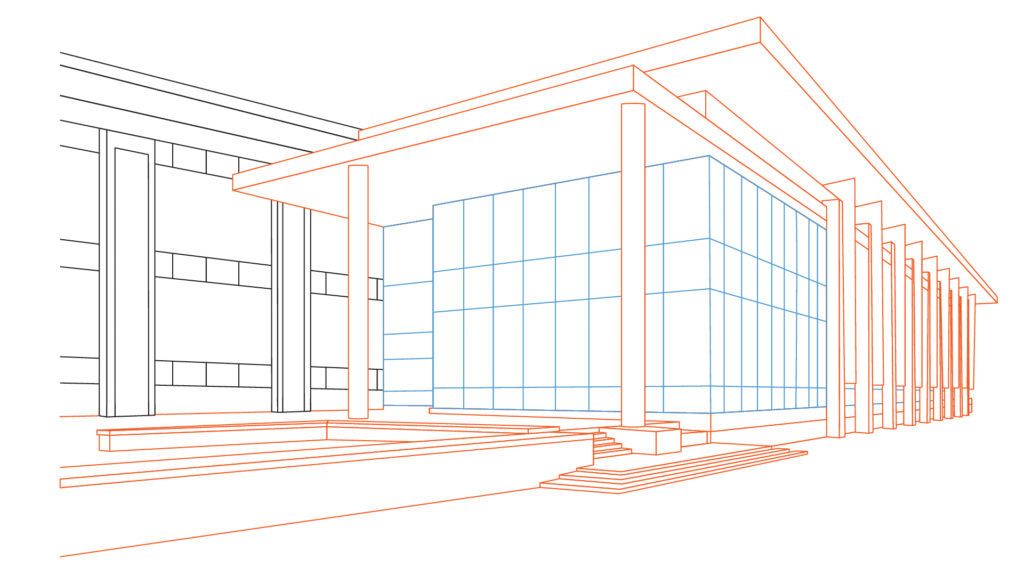
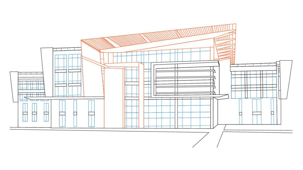
A sketch of the Kent State Integrated Science Building
The integration of old and new at the Integrated Science Building creates a unified platform for chemistry and life sciences research.

The final phase of this renovation was the construction of a new Integrated Science Building. This three-story facility connects to the existing Williams Hall structure, creating an integrated platform for chemistry and life sciences research that also draws non-science majors into an area where they will be exposed to STEM disciplines. The combination of several small, high-impact interventions, and a large addition for new programs transforms the future of the sciences at Kent State, with minimal impact to the student experience.

A before and after shot of the gateway at Bryan Hall

At Washington University in St. Louis, the School of Engineering and Applied Sciences had vacated Bryan Hall, creating a practical opportunity to redesign the building’s interior for interdisciplinary chemistry research. It also presented a chance to boldly transform the façade of the building, turning what was a “back door” to campus into an important gateway. It was also a chance to integrate a contemporary structure into the campus’ Collegiate Gothic vernacular.

Inside the building, the central corridor was relocated to the north side of each floor to allow a large flexible layout within the labs and sweeping views from the common spaces. A communal stair connects lab levels, as does a two-level programmed bridge spanning a major campus entry.

A sketch of Bryan Hall features the glassy new facade with terra cotta fins.
Terra cotta fins on a glassy new façade transform Bryan Hall into a feature gateway.

On the exterior, a glass wall replaced the north façade’s existing heaviness to allow daylight into adjacent write-up spaces and common areas and to capitalize on views of the wooded neighborhood beyond. A terracotta fin screen layered over the glass creates a new façade expression. Sustainable features include passive sun-shading and zoned mechanical systems. Although the building is equipment-rich and energy-demanding, Bryan Hall is on track for LEED Gold certification.

Zachry Engineering before and after
4. Scrap the precast, save the frame.

The Zachry Engineering Center, built in 1972, was a design of its time: a concrete box with relatively few windows, sited on a then-remote edge of the Texas A&M University campus. The College of Engineering had a new vision for program delivery and wanted a dramatically changed building to support that vision. In response, the 330,000 gross square feet Zachry Center was gutted down to its (very solid) structural frame, while its mechanical, electric, and plumbing systems were all removed and replaced.

It also received a 200,000 gross square feet addition, which was possible due to the way the building was first built. The original four-story structure was designed to support two additional floors. Contemporary building codes frequently prevent the realization of such intended additions, but in this case the addition of one floor was both possible and desirable. Through extensive site design and building massing, our design team created a more complex and site-responsive building form. Besides the need to add more space, the facility lacked height relative to its neighbors. Post intervention, what is now called the Zachry Education Engineering Complex (EEC) is five stories high and more appropriately scaled to its surroundings.

To further connect the EEC to its neighbors, the design adds three new entries aligned with adjacent buildings, creating an “engineering walk” that ties back to campus and sets up sites for potential new construction. The addition extends out to address a nearby street line, establishing a more consistent campus edge. The exterior now consists of local stone, glass, and metal panels that fit much better into the context of campus than the now-gone precast.

The idea of transparency is apparent in the building’s interior organization as well. The activity of learning and discovery is visible and engaged. The spaces in this new complex include active/collaborative classrooms that allow instructors and teaching teams to reconfigure the space to best fit teaching needs and course design, and common labs with interdisciplinary themes.

Zachry Education Building sketch
The addition of a floor to Zachry Engineering Education Center made the project more appropriately scaled to its surroundings.

Now at more than 500,000 gross square feet, the EEC is the third-largest building on the Texas A&M campus (trailing only the football stadium and the library). Its transformation is a testimony to how structurally solid many Brutalist buildings still are, and how renovations can be a better solution – programmatically, financially, ecologically, and aesthetically – than demolition.

While the heyday of mid-century campus architecture has come and gone, thoughtful and creative interventions can bring these structures into a new age. As higher education seeks ways to philosophically and physically reinvent itself in the 21st century, the renovation and renewal of such buildings serve as both powerful symbols and practical investments.


These designs were completed in partnership with Payto Architects (Kent State University), Trivers (Washington University in St. Louis), and TreanorHL (Texas A&M University).

Your browser is out-of-date!

Update your browser to view this website correctly. Update my browser now

×