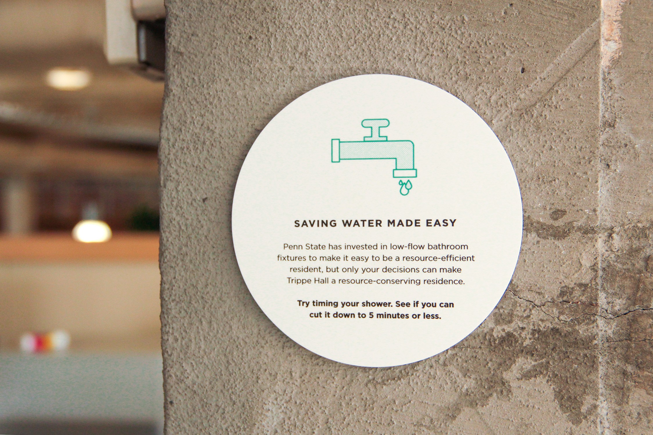
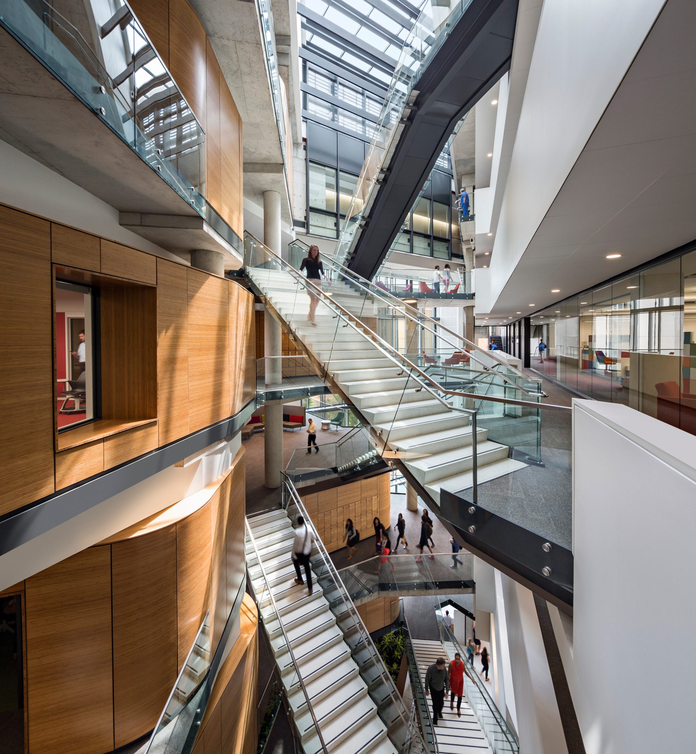
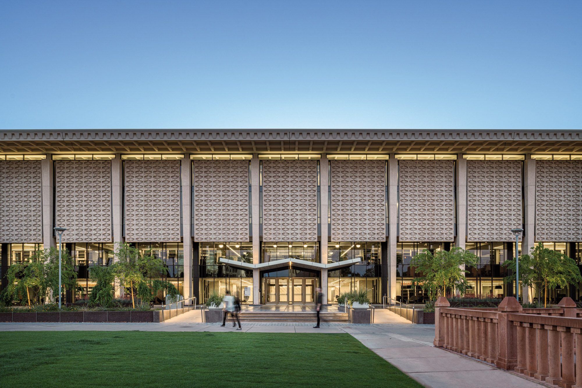
As a firm, Ayers Saint Gross designers continuously challenge one another to be on the forefront of sustainable design. This drive, coupled with our interdisciplinary structure, allows us to find and offer benefits where it might be thought there are none. Signage and wayfinding is an area where the sustainability benefits can be more significant than initially apparent, while also improving the campus landscape with beautiful designs that help visitors, students, faculty, and staff alike.
The largely unseen benefits start before signs are even produced. Something that is not always thought about: how many signs do you need and where do you put them? What areas are confusing to visitors? What are the names or phrases we use on campus vs. with the public? These and many other questions can provide opportunities for our team as we study a campus and interview stakeholders. An effective signage and wayfinding plan is something that is harder to notice when done right, but glaringly obvious if done poorly or completely absent. Considering how many hundreds — or in some cases thousands — of events can be held on a campus in a year, any needed corrective signs or temporary solutions can be wasteful, look bad, and typically won’t improve wayfinding anyway. This is what we seek to avoid.
Prior to the start of a signage and wayfinding project, there is crucial research and understanding that must take place. We visit the campus, we walk paths, observe student interactions with their environment, take photos, and document current signage conditions. We seek out wayfinding successes and deficiencies to facilitate an informed discussion with the project stakeholders. Through extensive touring, interviews, and intensive workshops, our goal is to fully understand a campus.
After reviewing the needs and priorities of the campus with stakeholders, we establish program goals and objectives, key design elements, and wayfinding logic. We discuss whether there are destinations we should prioritize (e.g., a large venue or public amenity) or de-prioritize (e.g., maintenance areas). We also review tactical details including project budget requirements, maintenance and flexibility, communication protocol, and any schedule adjustments or phasing plans for implementation. This engagement in the planning stages ensures that the correct number of signs is planned for, the placement is thoughtful, and the amount of disruption is as little as possible.
The final sustainability results of this process avoids committing resources in wrong places, provides a clarity in wayfinding (e.g., you don’t have people driving around the campus unsure of where to go), and the solution is long-lasting, both from a design perspective and in its construction. Speaking of which…
Modern wayfinding systems make the most of recycled materials. Most exterior signage is made from aluminum, and most aluminum from fabricators is post-consumer. If a new signage and wayfinding system is replacing a preexisting system, those old signs can usually be recycled or scrapped. Either way, old signs are not just winding up in the trash.
Another major piece of sign fabrication is painting. The paint used in signs is essentially automotive paint which optimizes durability and adhesion to the aluminum. Progress has been made in recent years to produce low-volatile organic compound paint to comply with environmental laws. Those strides benefit what gets used in sign fabrication as well.
To further aid the durability of signs, designs themselves are planned to be long-lasting in their aesthetic — an outcome aided by the extensive engagement detailed earlier. There are also options for adaptability, including digital signs or magnetic panels to change messaging while retaining the design intent of the sign. These options limit the need for temporary signs, which create sign clutter and waste.
Of course, aluminum and paint aren’t all there is to think about. Many colleges and universities are representatives of their surrounding locations and have iconic materials that define the region or the character of the campus. We celebrate what makes a campus special.
Building on the goal of durability, signs can be developed using native materials. We take special care to source local materials, ensuring that signs fit their environments both from a design and a material perspective. These design elements encourage environmental stewardship by reinforcing the natural surroundings.
Another less visible factor is how the sign gets to its installed location. When possible, we make efforts to use fabricators local to the site region, so signs simply don’t need to travel as far to be implemented. This cuts down on expended resources due to travel, while supporting the local economy.


