Ideas / Research & Design / 10.13.2020

How Signage Optimizes High-Performance Buildings

The LEED Silver building features 25 distinctive signs highlighting the various sustainable features....

As more high-performance design methods, materials, and systems are implemented in the built environment, it’s important not to forget that we as the human occupants of buildings still play a big role in their impact. Understanding occupant activities – the way people experience and use a structure over its lifespan – is key to maximizing the long-term value of any project and is a crucial part of creating effective designs. 

Thoughtful signage can inform, inspire, and ultimately bolster a building’s long-term success, ensuring that high-performance elements remain front and center for users throughout a project’s lifecycle. Ayers Saint Gross encourages interdisciplinary collaboration between our architecture and graphic design studios to create building-specific interior illustrations. Here are two examples from our portfolio that illustrate how signage can reinforce sustainable design choices and create more successful buildings. 

Trippe Hall at Penn State Behrend 

Penn State University has a robust sustainability mission to “comprehensively integrate sustainability into the University’s core fabric of research, teaching, outreach, and operations that will transform students, faculty, and staff into competent sustainability leaders capable of carrying out our vision for the future.” However, overall efforts can sometimes be difficult to implement at individual campuses. 

For a residence hall at Penn State Behrend, sustainability signage had two major benefits: it earned LEED points via an Integrated Education Innovation Credit, and it helped align the Behrend campus’ sustainable efforts to the university’s mission. With increased mission awareness, Penn State students hopefully feel individually empowered and connected to each other by their sustainable actions.  

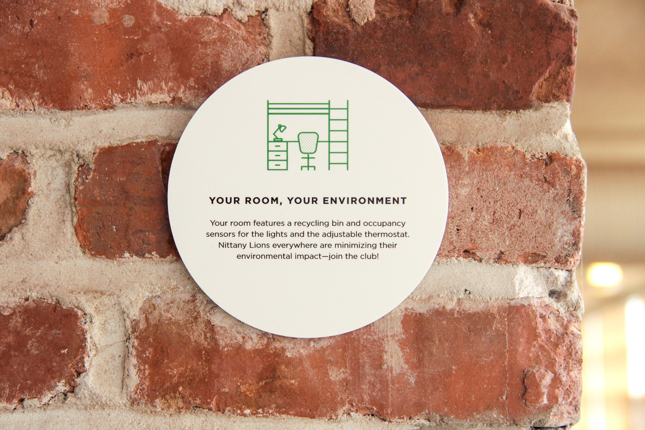
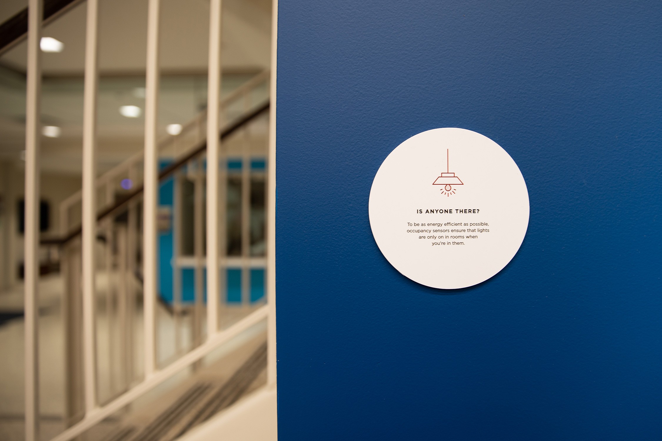
To highlight Trippe Hall’s high-performance elements, we designed a system of 26 unique interior signs that call attention to sustainable features throughout the building. 
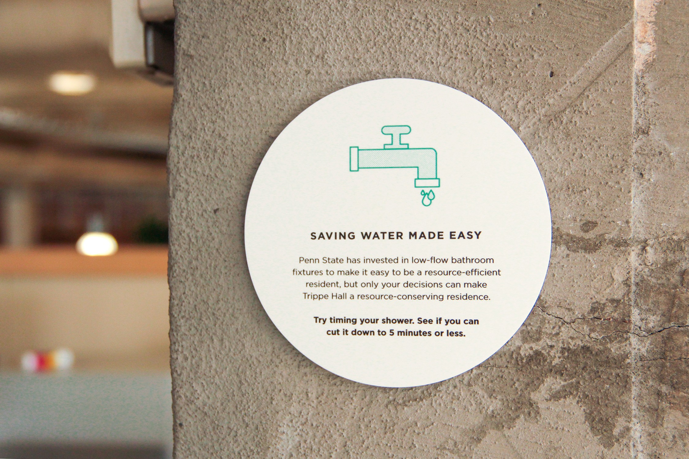
Sustainability signage for Penn State Behrend Trippe Hall
The LEED Silver building features 25 distinctive signs highlighting the various sustainable features....

Of course, simply putting stats on signs is usually not enough to engage users. A didactic approach isn’t fun or memorable. So our design team created slightly cheeky copy and graphics, and used a relatively scaled-down size for the interior sustainability signage. The small, strategically placed signs are a fun discovery when a user adjusts shades in the lounge or does laundry. The interdisciplinary collaboration among our interiors, sustainability, and graphic design studios, and our in-house writing staff, resulted in a custom system that is memorable and inspires action.   

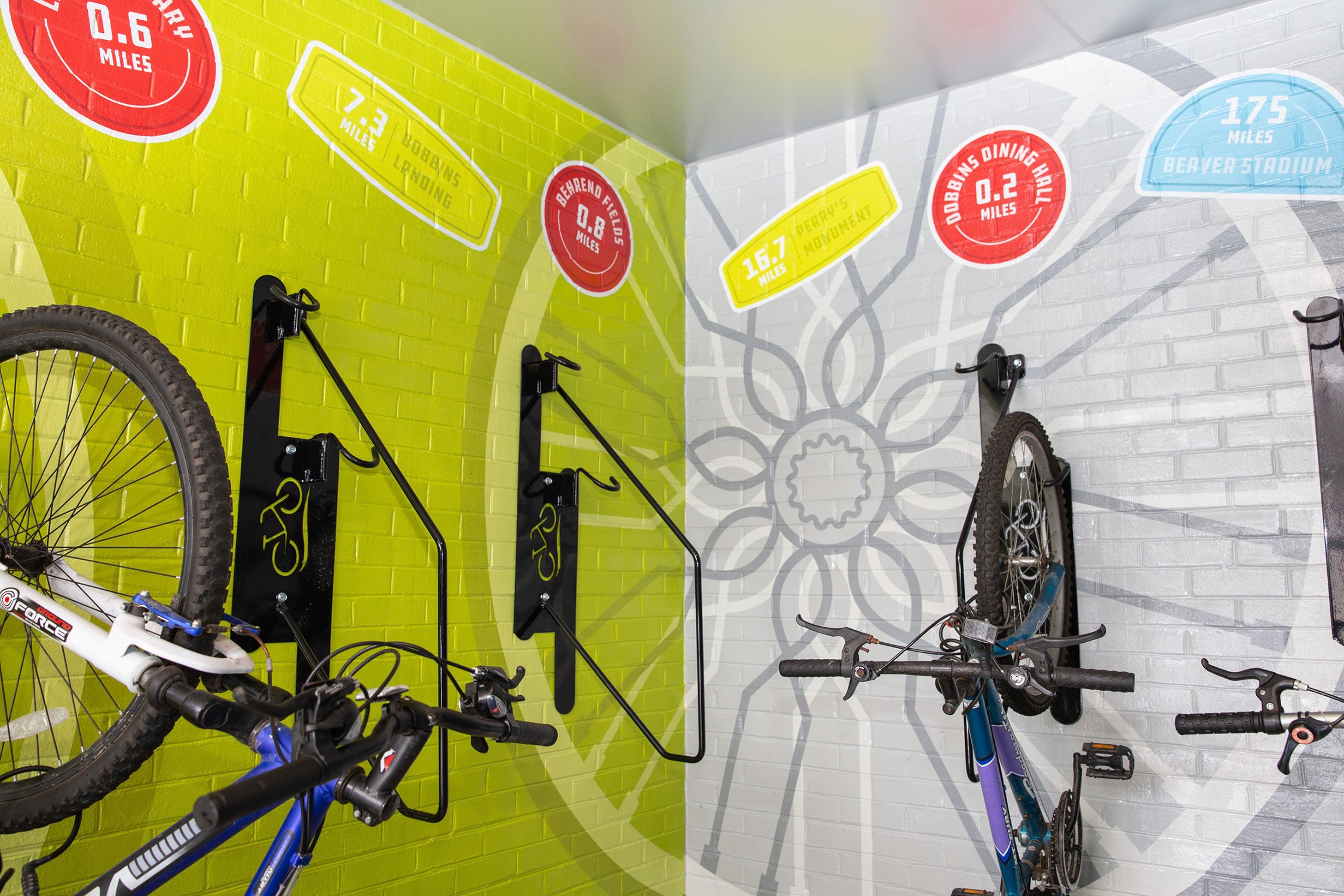
Detail view of the environmental graphics covering the walls of the bike room at Trippe Hall at...

We also created a 43.5’ x 9’ vinyl wall graphic in the bike storage area, an exterior space in the notch of the building. The large, bright graphic provides desired lightness to the otherwise dark space. Included on the graphic are “stickers” that list destinations around campus and their bikeable distances, encouraging the use of bikes over vehicular travel. 

Bancroft Elementary School

District of Columbia Public Schools (DCPS) modernizations target LEED Gold certification and incorporate sustainability signage. The goal of including sustainability signage is to educate students on the benefits of sustainability and encourage environmental literacy and awareness. 

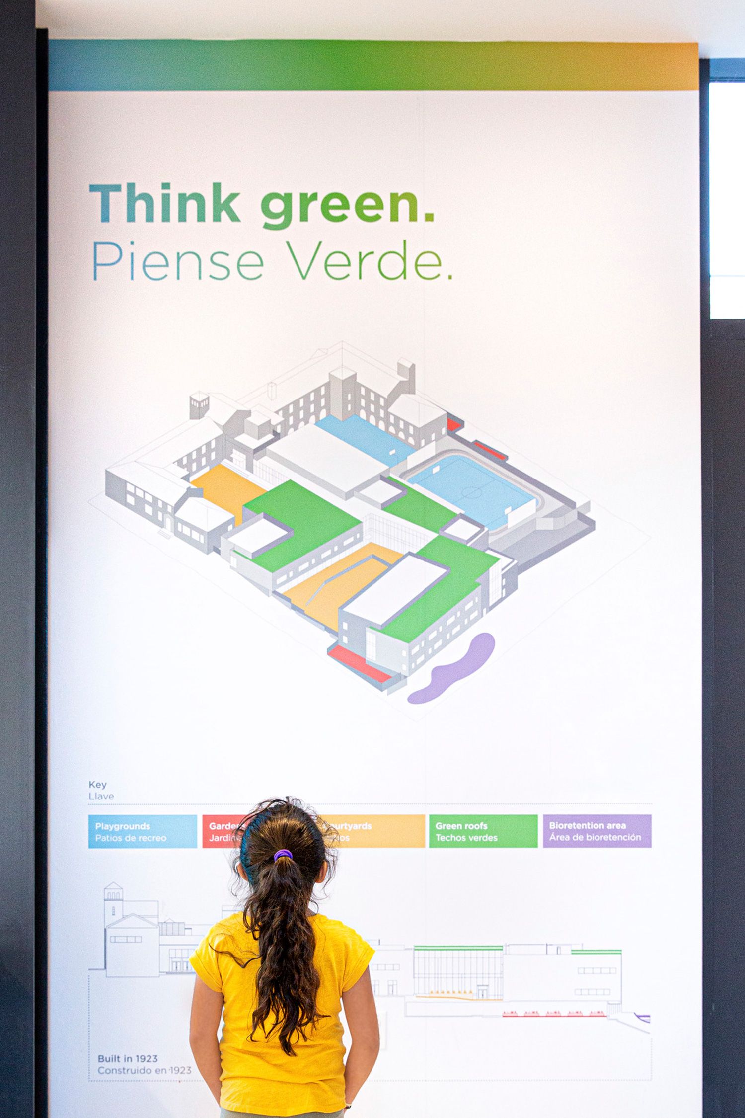
As a part of the renovation and addition to Bancroft Elementary, sustainability signage was included as a part of a larger custom signage and wayfinding system. Originally proposed as a six-sign system installed throughout the school, our design evolved into one large graphic in a highly visible location at a scale appropriate for an elementary school audience. While small-scale signs with an element of surprise and discovery work well for college students, elementary-age students have short attention spans and multiple signs diluted the overall message. Additionally, since Bancroft students are usually confined to grade-level corridors, chances of all the students seeing all signs were limited. 

Navigational department signage detail at Bancroft Elementary School
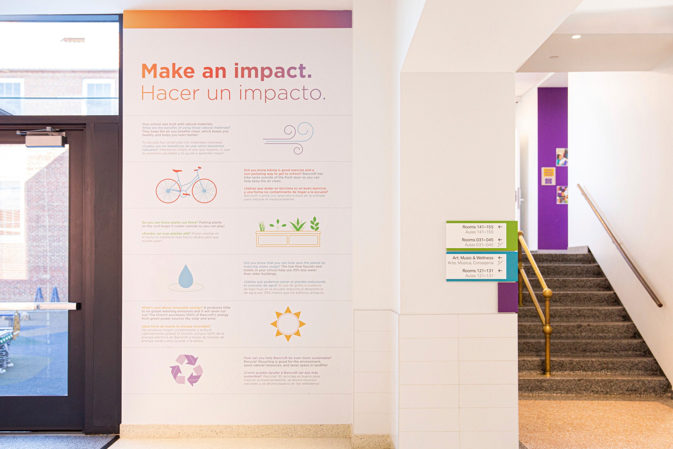
Sustainability signage educates students about green building features at Bancroft Elementary School

Ultimately, we designed a 12’ x 10’ graphic for wall spaces on either side of the doors leading to a playground along a main corridor. Colorful graphics and statistics combined with kid-friendly messages in English and Spanish align with the school’s bilingual curriculum. 

Both Trippe Hall and Bancroft Elementary demonstrate a heartening trend toward displaying sustainability information and inspiring a building’s users to take action.

Sustainability signage educates students
Your browser is out-of-date!

Update your browser to view this website correctly. Update my browser now

×