This site uses cookies – More Information.
Visualizing Sustainability
Ayers Saint Gross
A poster campaign uses data visualization to inspire sustainable storytelling.
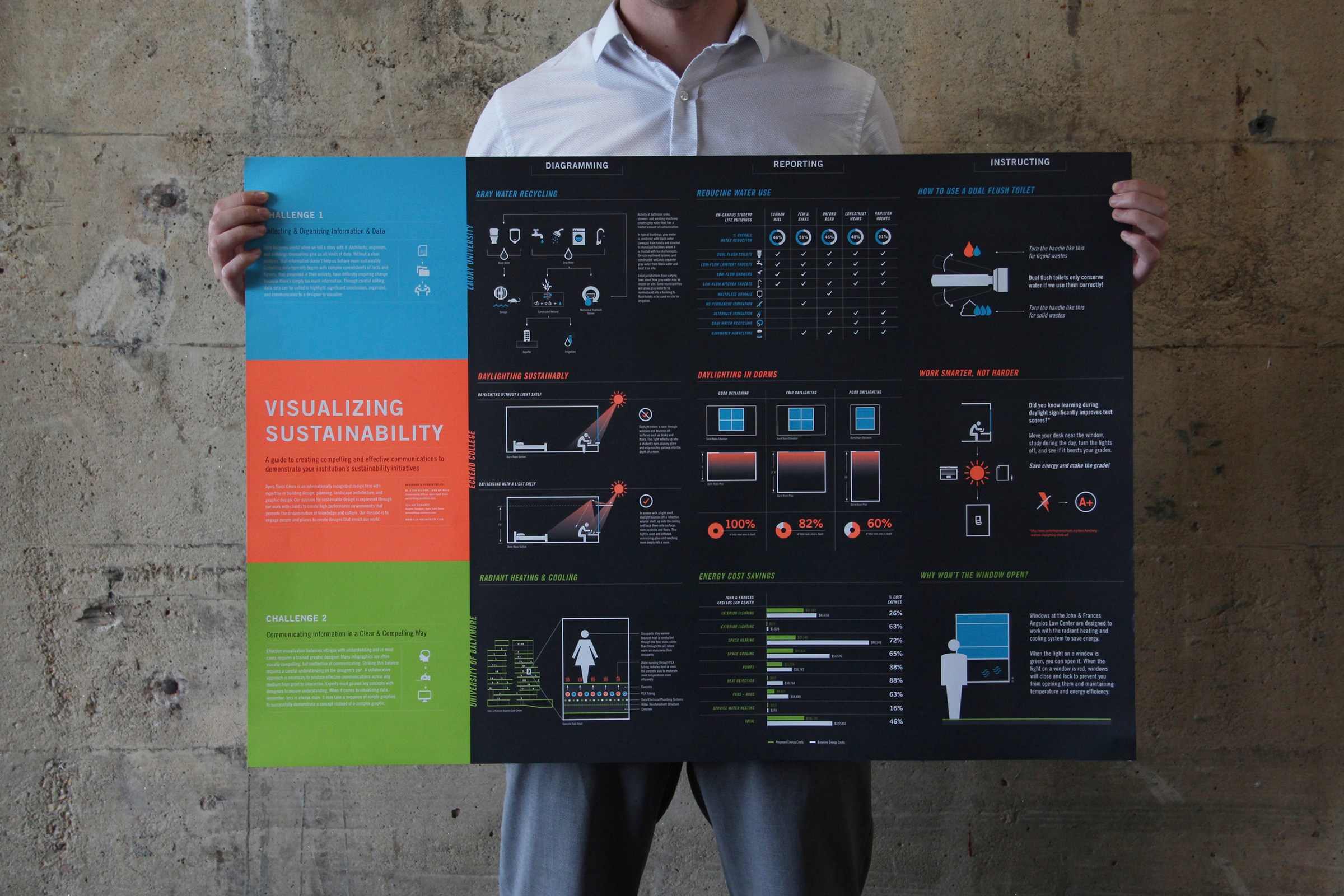
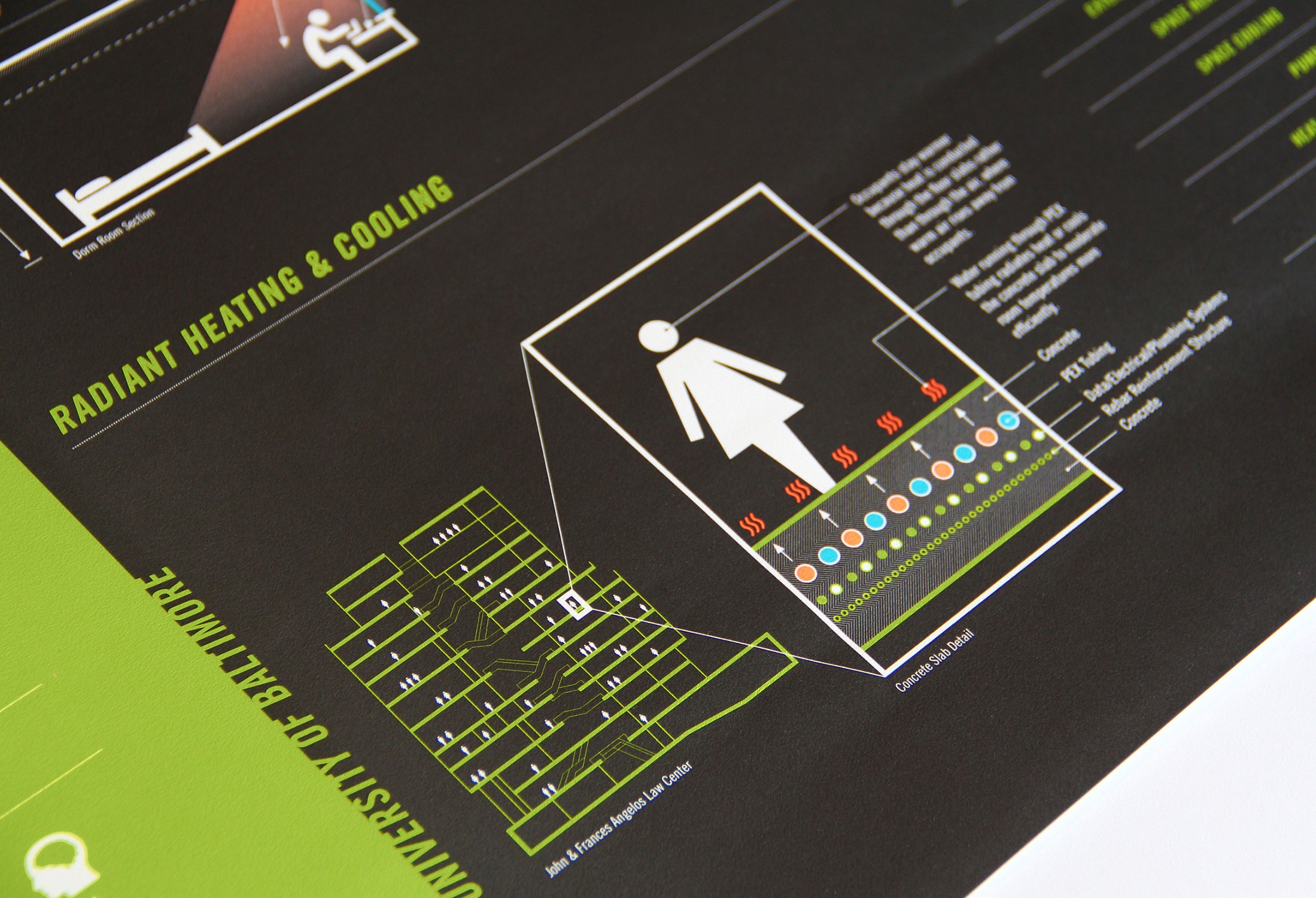
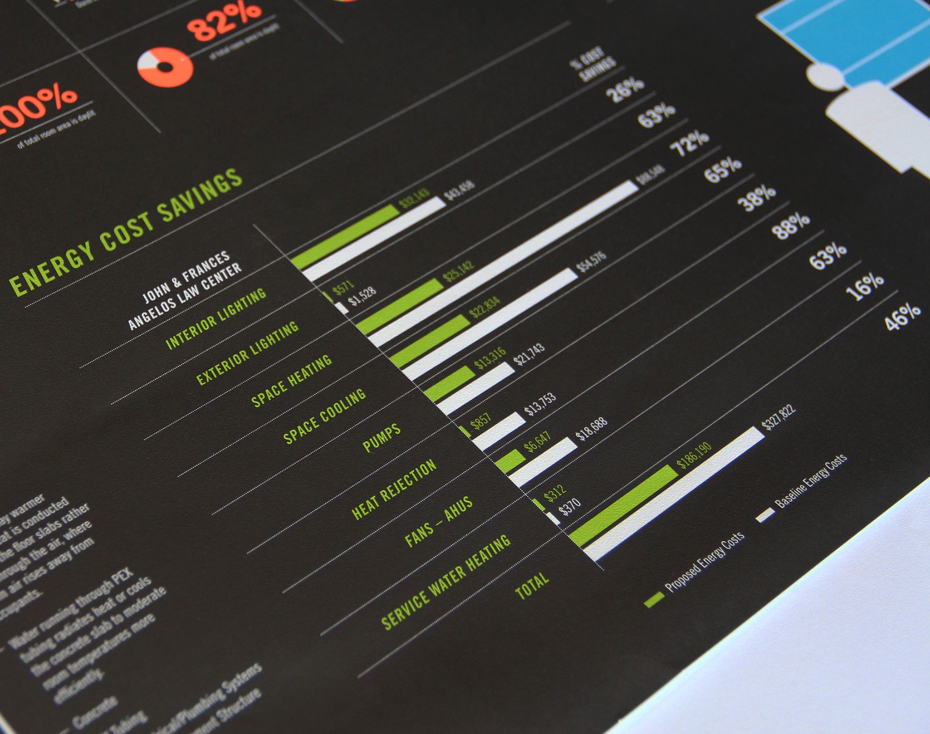
Effective data visualization balances intrigue with understanding. Data becomes useful when we tell a story. Ayers Saint Gross designed a poster for the Association for the Advancement of Sustainability in Higher Education (AASHE) conference that serves as a guide to creating more compelling graphic communication and inspiration to make sustainability initiatives more relatable. Spreadsheets may deliver statistical proof, but they do not easily inspire or change behavior. Pairing succinct information with graphic visualization compels students, faculty, and administrators to become more engaged with sustainable topics.
Next Project
Arboretum Cultural District Concept Plan
Pennsylvania State University